

Master Newsletter Banner Designs for a Greater Subscriber Impact
Looking for a guide on email banners? Then you’ve come to the right place!
Newsletter banners are excellent for grabbing the audience’s attention. They can significantly impact the readability and attractiveness of your email campaigns. And today, we will guide you through the what, why, and how of newsletter banners, provide actionable tips for creating your own banners, and show how Blocks can assist you.
Kickstart your campaign with Blocks!
Sign up now to design your excellent email templates
Try for free!
Kickstart your campaign with Blocks!
Sign up now to design your excellent email templates
Try for free!What is a Newsletter Banner?
A newsletter banner is typically the first visual element that readers see when they open your email. It’s a graphical representation that sets the tone for your newsletter, acting much like a headline in a newspaper.
Email banners usually contain the company logo, the newsletter title (or a compelling message that resonates with your audience), and visuals connected to your brand in some way. The key here is to make your banner intriguing, relevant, and in sync with your brand identity.
Newsletter Banner Size
When it comes to email banner design, it’s crucial to get the size right to ensure it looks good on all devices and doesn’t take up too much space. Here are 2 most widespread newsletter banner sizes:
• Full-Width Banner. This banner typically stretches across the full width of the email (commonly set at 600px, the standard email width). Most email clients, from Gmail to Outlook, support this size, ensuring the banner displays correctly.
However, the height of the email banner is flexible, usually ranging between 200px and 500px. This way, it remains noticeable yet relatively compact. The final choice depends on your template design: just make sure the banner is visually balanced within the overall template layout.
• Half-Width Banner. A half-width banner usually stands around 300px wide. It’s an excellent option if you want the email banner to share space with other important elements like text or visuals.
In terms of height, half-width banners follow the same principles as full-width banners. It’s vital to maintain visual balance, ensuring the email banner is not overwhelming yet still large enough to attract attention.
Mobile devices bring another set of considerations. Screen sizes here are generally smaller, so it’s important to ensure your newsletter banner adapts well for a seamless mobile viewing experience. Test your email banners thoroughly and make sure they scale properly on different devices.
4 Things to Add to Your Email Banner
A well-designed banner is more than just an attractive image. It’s a strategic blend of several elements that work together to catch the reader’s eye and convey your primary message.
Let’s take a look at 4 essential aspects to consider when crafting your email banners.
Brand or Company Logo
The logo is an instant identifier for your brand. Position it prominently in the email banner to reinforce brand recognition among potential and existing clients. Align it with your visual guidelines, such as color scheme and typography, to ensure consistency and stay on brand all the way through.
Catchy Headline
A compelling headline is a hook that reels the audience in. It should be brief, engaging, and directly linked to the content of your newsletter. A good headline piques curiosity, evokes emotion, or offers value, encouraging recipients to explore further.
Relevant Images
The visual appeal of your email banner design is integral to your campaign. Use high-quality images that are relevant to your newsletter content and always remember that the visuals should blend seamlessly with other design elements.
Call-to-Action (CTA)
Whether “Shop Now”, “Learn More”, or “Sign Up”, a CTA in an email banner guides your audience to the next step. Make it eye-catching using contrasting colors, ample white space, and an easy-to-read font. Ensure the CTA aligns with the goal of your newsletter, prompting readers toward the desired action.
10 Newsletter Banner Design Ideas for Your Inspiration
And now, it’s time to make first-rate email banners for your templates!
Whether you announce a new product launch, promote sales, or share other important information in your newsletter, these 10 email banner design ideas will serve as an effective way to boost your email marketing strategy.
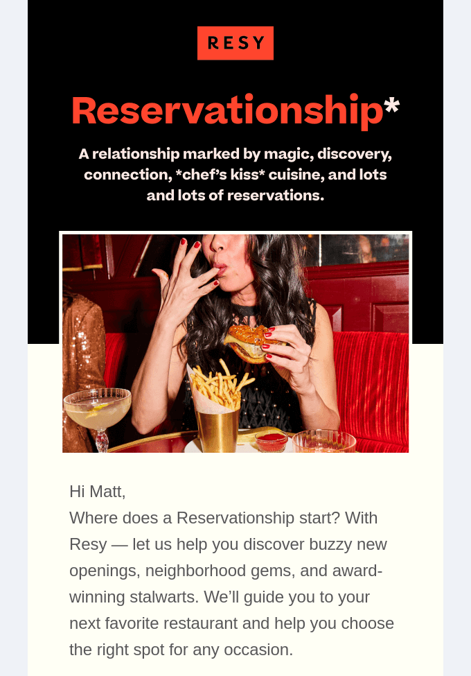
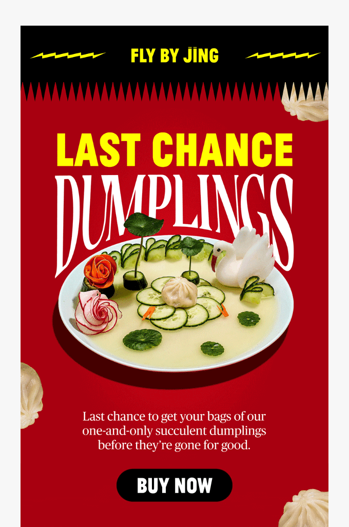
Play with Colors
Colors in your banner image aren’t just for show: they evoke emotions and make your email stand out. Use your brand colors for consistency or experiment with different designs and palettes to infuse your templates with a creative touch. For instance, vibrant colors in a banner design can convey excitement, while muted tones can reflect sophistication.
In this email example by Resy, the red color of the email banner coincides with the logo, while the black and yellow make the banner stand out. This combination adds a touch of boldness and makes the email catchy at a glance.
Use Typography Wisely
Typography can significantly influence the readability and mood of your email banner. Try combining different font styles and sizes to establish a visual hierarchy and guide your readers. However, ensure that the fonts are legible and complement each other.
The example below shows how to use non-standard fonts without making the banner difficult to read. As a result, we have an email that’s both effective and pleasing to the eye.
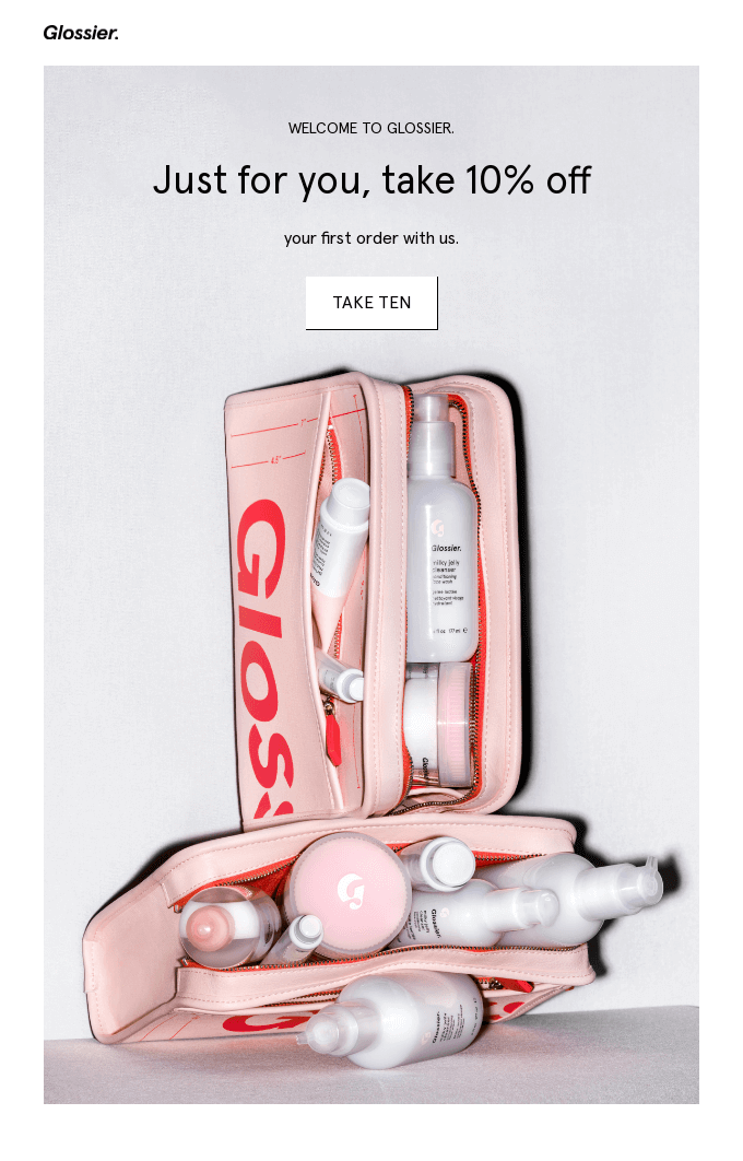
Highlight Offers in Email Banners
Your brand is offering special deals or discounts? Highlight them in your email banner to drive sales! Use various elements that draw attention and spark interest. For example, your banner may include:
- bold letters
- contrasting colors
- engaging language
- highly visible numbers
The Glossier team provides one of the best examples here. The special offer is featured prominently, while the email banner remains effective on both the desktop and mobile.
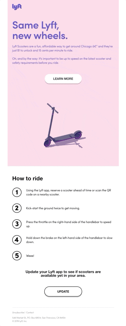
Animate Your Email Banner
Animated GIFs are an eye-catching element that adds motion to your email banner. Whether a subtle transition effect or a full-fledged animated cartoon, it can make your banner more engaging and memorable. Just make sure it doesn’t distract readers from your key message.
Here’s a cool example by Lyft. The GIF in its email banner not only makes the message entertaining and vibrant, but also showcases the product itself.
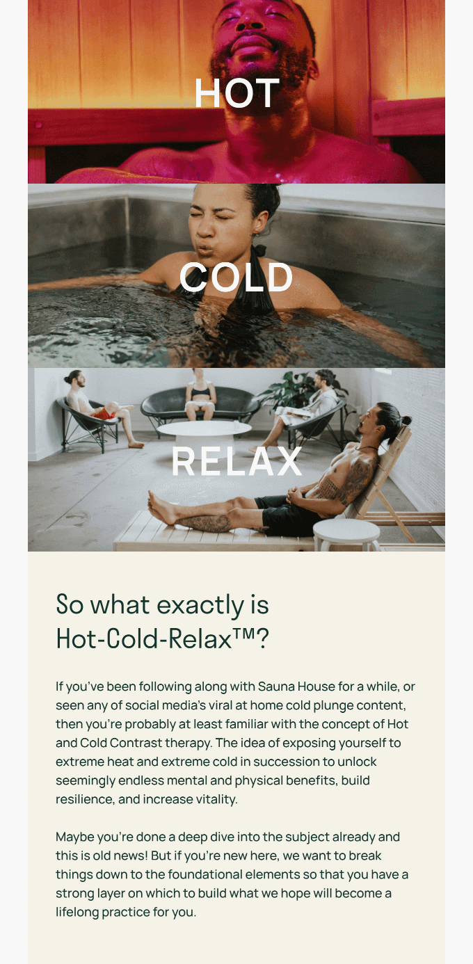
Tell a Story
Who doesn’t like a good story? Narratives in your email banners can underline the message and engage recipients on an emotional level. Consider creating a sequence of images or text elements for the banner to unfold a captivating story related to:
- your brand
- product line or service shown in the email
- special occasion linked to the campaign
This email example by Sauna House shows the full range of sensations you’ll experience when visiting the sauna. Splendid visuals guarantee that potential customers can easily associate themselves with the people in the photos.
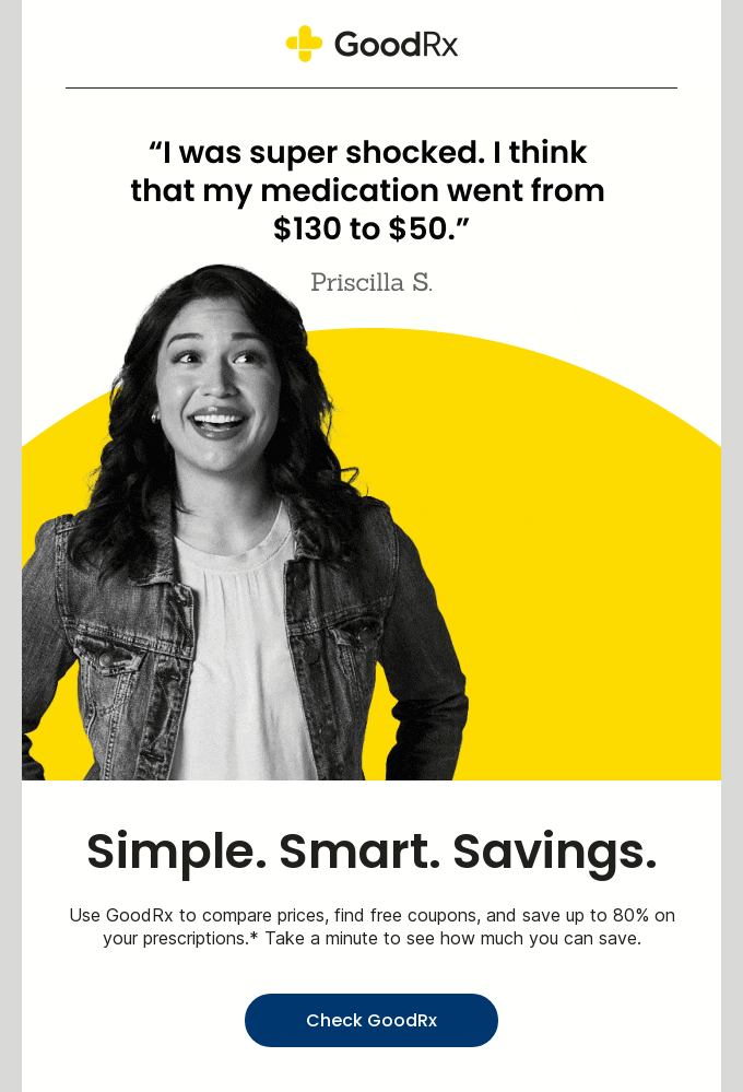
Feature Testimonials
Never underestimate the power of social proof! Positive customer feedback included in your email banner can boost your brand credibility and trustworthiness.
Include a brief, compelling testimonial along with the customer’s name and photo for authenticity and create an atmosphere of trust even among the most skeptical recipients! Of course, don’t forget to ask for your customer’s permission before including their photo and review.
Here’s an excellent email example by GoodRx that is short but serves its function flawlessly. It features a review by a real customer along with their photo, making the email very powerful.
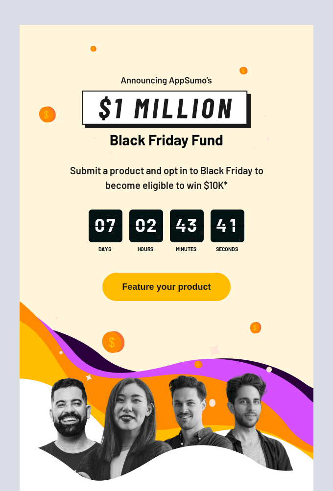
Include a Countdown Timer
Want to promote limited-time offers in your templates? Include a countdown timer directly in the email banner! A small yet effective element, it directly taps into the fear of missing out, creates a sense of urgency, and encourages readers to take action quickly before the offer runs out.
In this email example by AppSumo, the countdown timer is combined with a catchy and clear call-to-action, urging an immediate response from the readers.
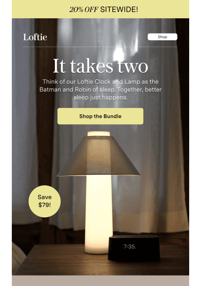
Showcase Products
If you’re launching new products or services, feature them in your banner. Use high-quality visuals combined with a compelling headline and CTA to:
- showcase your goods/service in the best light
- pique curiosity among customers
- drive conversions as a result
Here’s an email banner example by Loftie that promotes its clock and lamp as a perfect duo for any nightstand (and shows how both products look together).
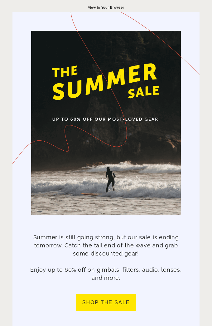
Seasonal Themes
Seasonal campaigns might be an excellent idea to boost sales and customer engagement. Tailor your email banner to align with seasons, holidays, or popular events to make your newsletters timely and relevant.
What’s best is that seasonal campaigns are available for many different business types! For example, here’s an email by Moment (a marketplace for photographers and filmmakers) that announces a summer sale and features a relevant summer-inspired image.
Use Infographics
The final idea for your email banners is to use infographics to simplify complex information and make it more digestible. Consider incorporating mini-infographics in your banner to share important stats or updates about your brand or industry. This could be especially useful for B2B newsletters.
Here’s one of the best examples of how to use this tip. In the email below, Glassdoor includes numbers to make its message more powerful.

Looking for responsive email templates?
Check our Template Gallery with 140+ free templates for you!
To the templatesLooking for responsive email templates?
Check our Template Gallery with 140+ free templates for you!
To the templates8 Steps to Create Your Stunning Newsletter Banner in Blocks
From email header to banner (and even the email signature), Blocks provides full capabilities to make your templates truly outstanding. With our drag-and-drop builder, designing the perfect emails becomes a walk in the park!
Ready to create your superb email banners? Simply follow these 8 steps:
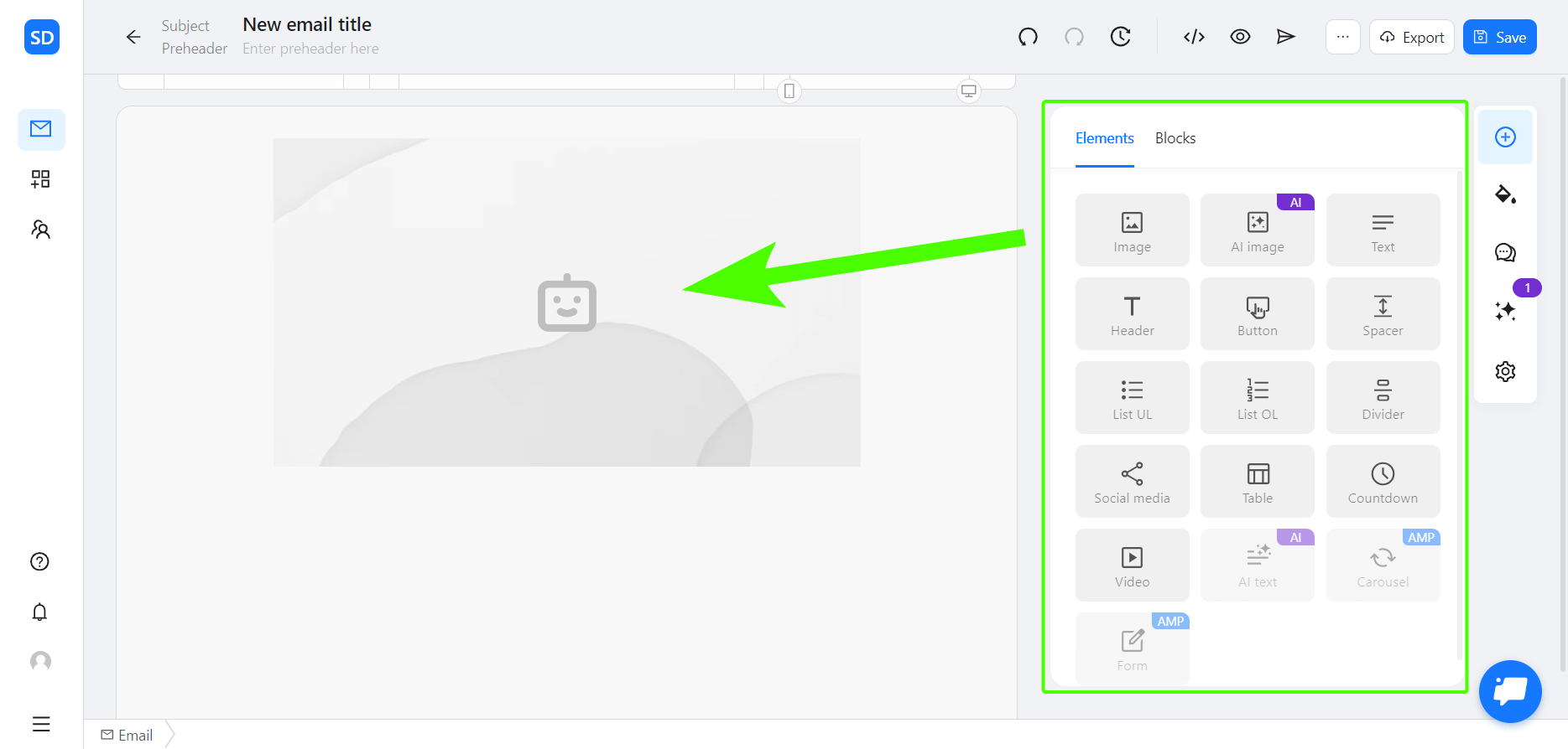
1. First, you need to add an image to your email. Go to the “Elements” section, click on the “Image” button, and drag it to your template.
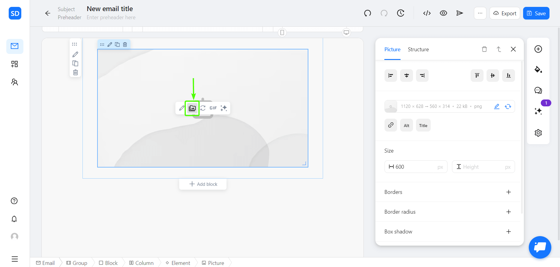
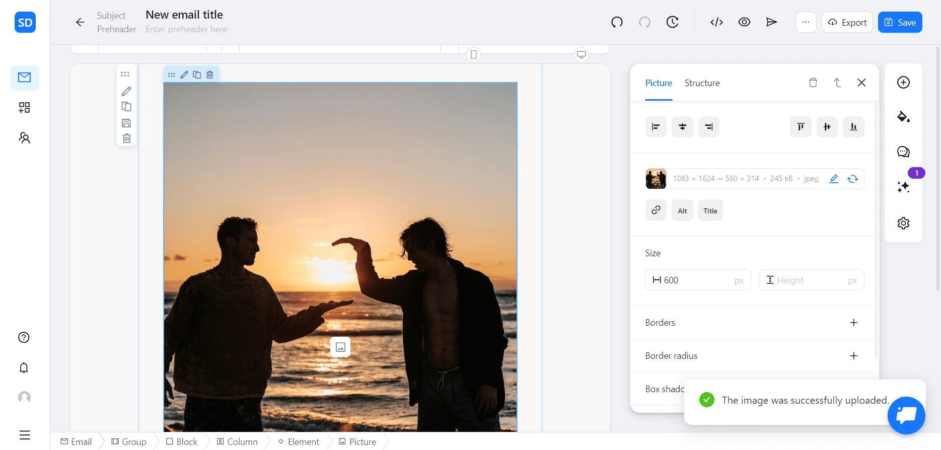
2. Place the cursor at the center of the image element: you will see a set of icons. Click on the indicated icon to open the Image Center.
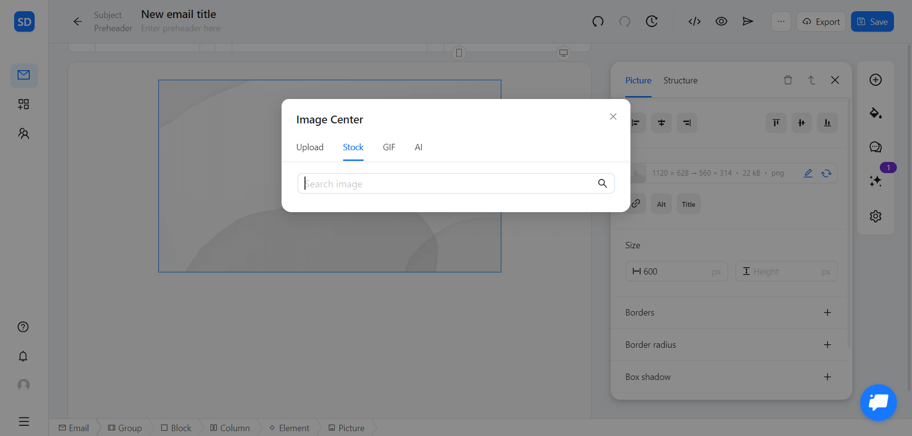
3. Here, you can upload your own photos, find visuals in our stock image library with hundreds of free options, or generate an AI image for your email.
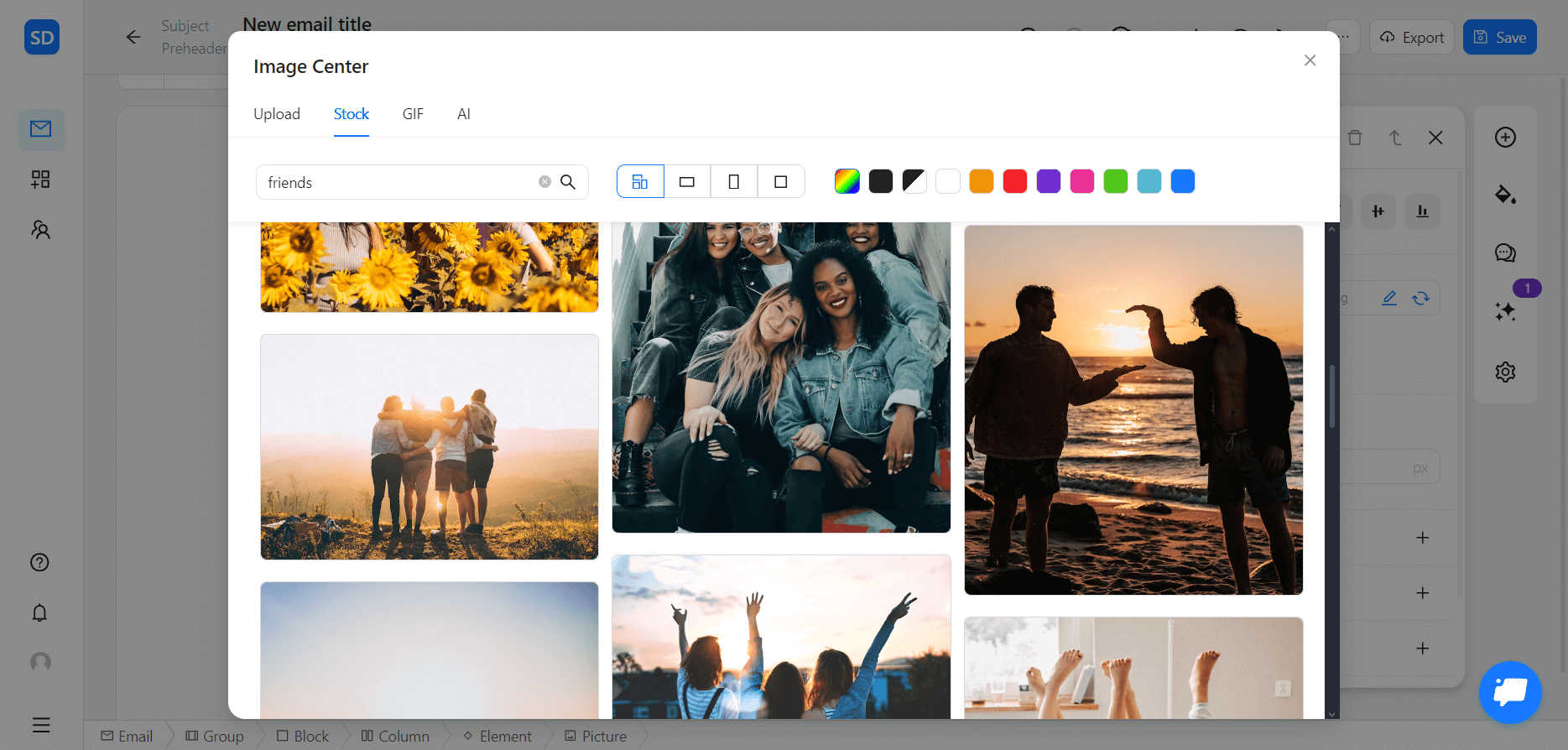
4. Let’s imagine that you’re creating an email about a referral program. You don’t have a ready-made photo, so you need to find a relevant picture to support your idea.
For this, select the “Stock” section, enter your search inquiry, and choose from the results you get. Use various filters to search for photos of a particular orientation or color scheme.
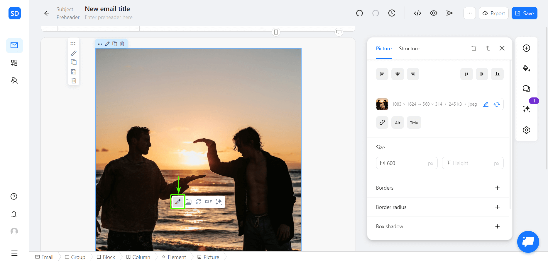
5. Found the perfect photo? Excellent! Now simply click on it to add it to your template. Easy as that!
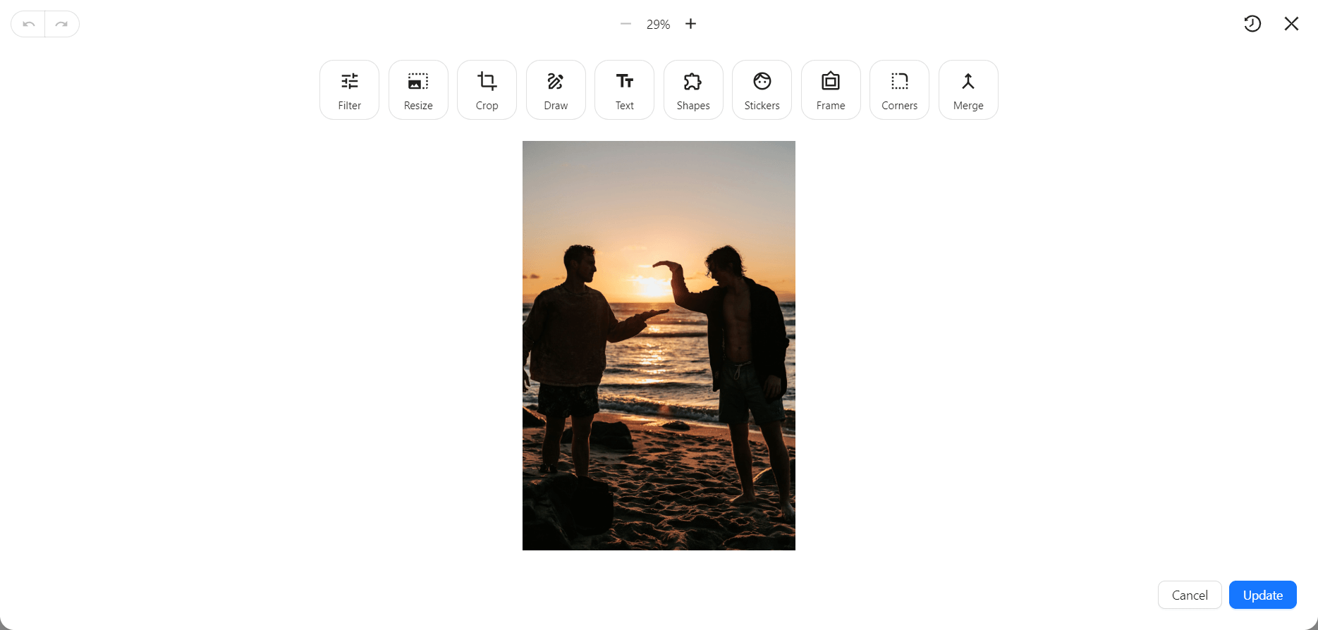
If you need to edit your visuals, click on the icon indicated here to enter the Image Editor.
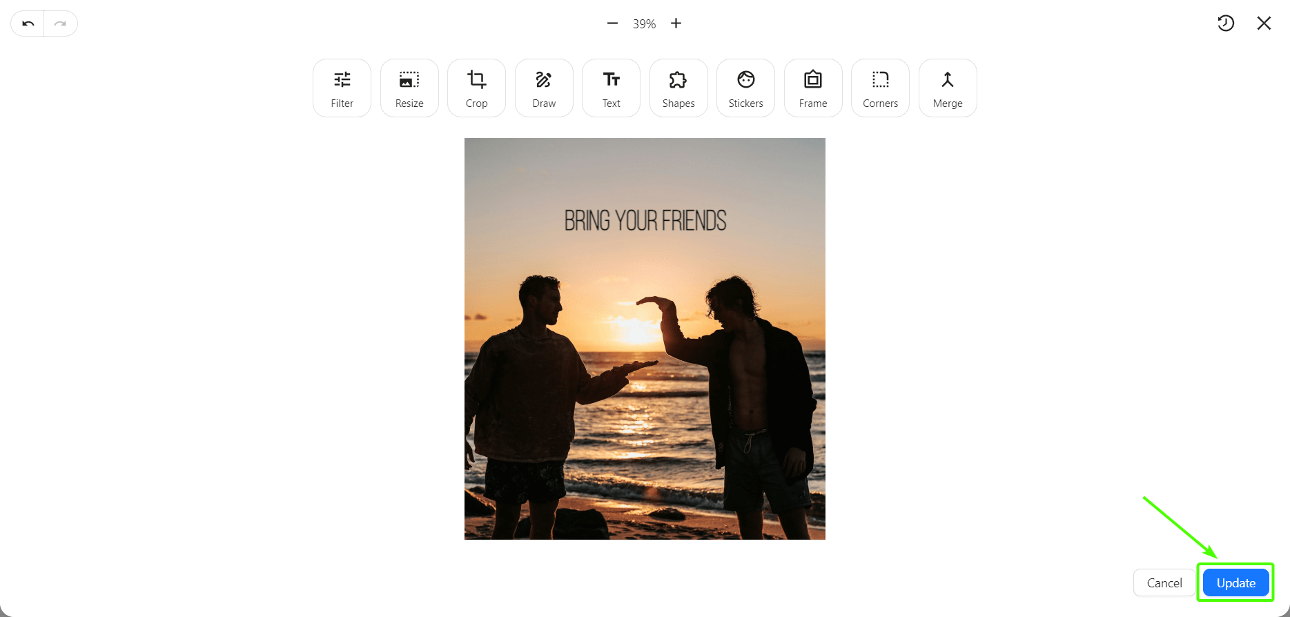
6. From here on, you can customize your visuals as needed: add some text, resize and crop the image, add rounded corners, and much, much more!
7. Here, I decided to add a CTA to the email banner and make it more appealing. In the “Text” section, you can choose the desired font, change the text color and its background, add shadows, and do lots of other things.
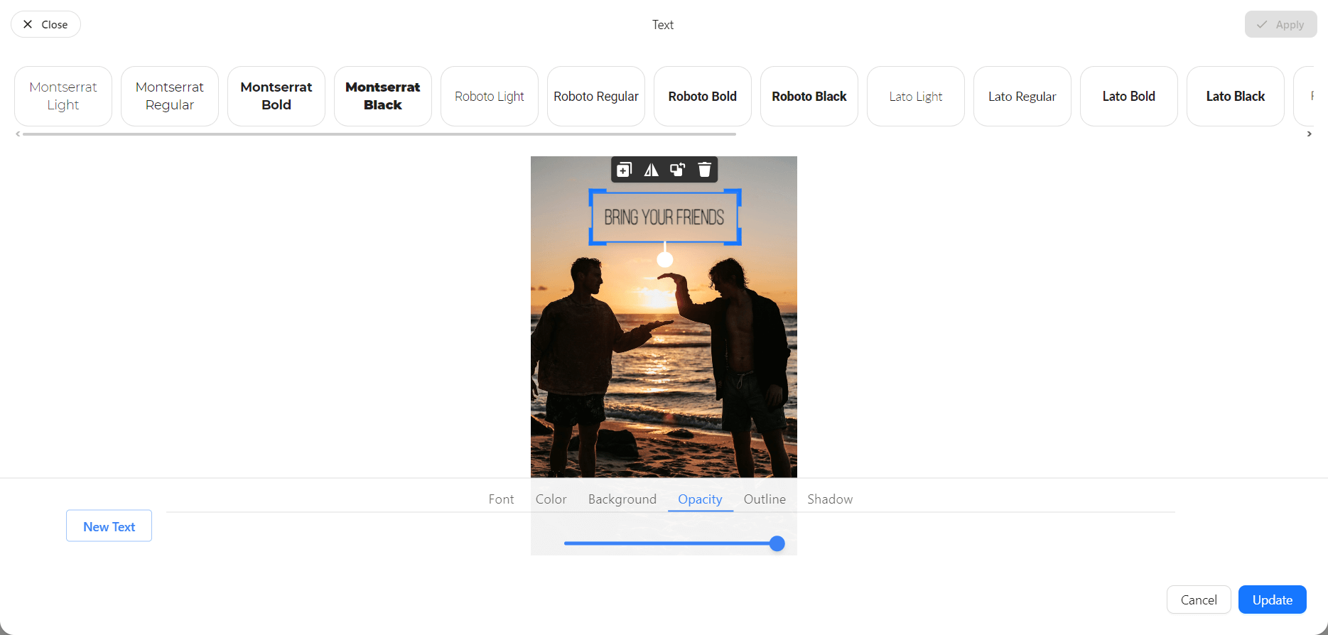
8. At last, when you’re happy with the email banner you have, click on the “Update” button, and voila: your template is ready to shine!
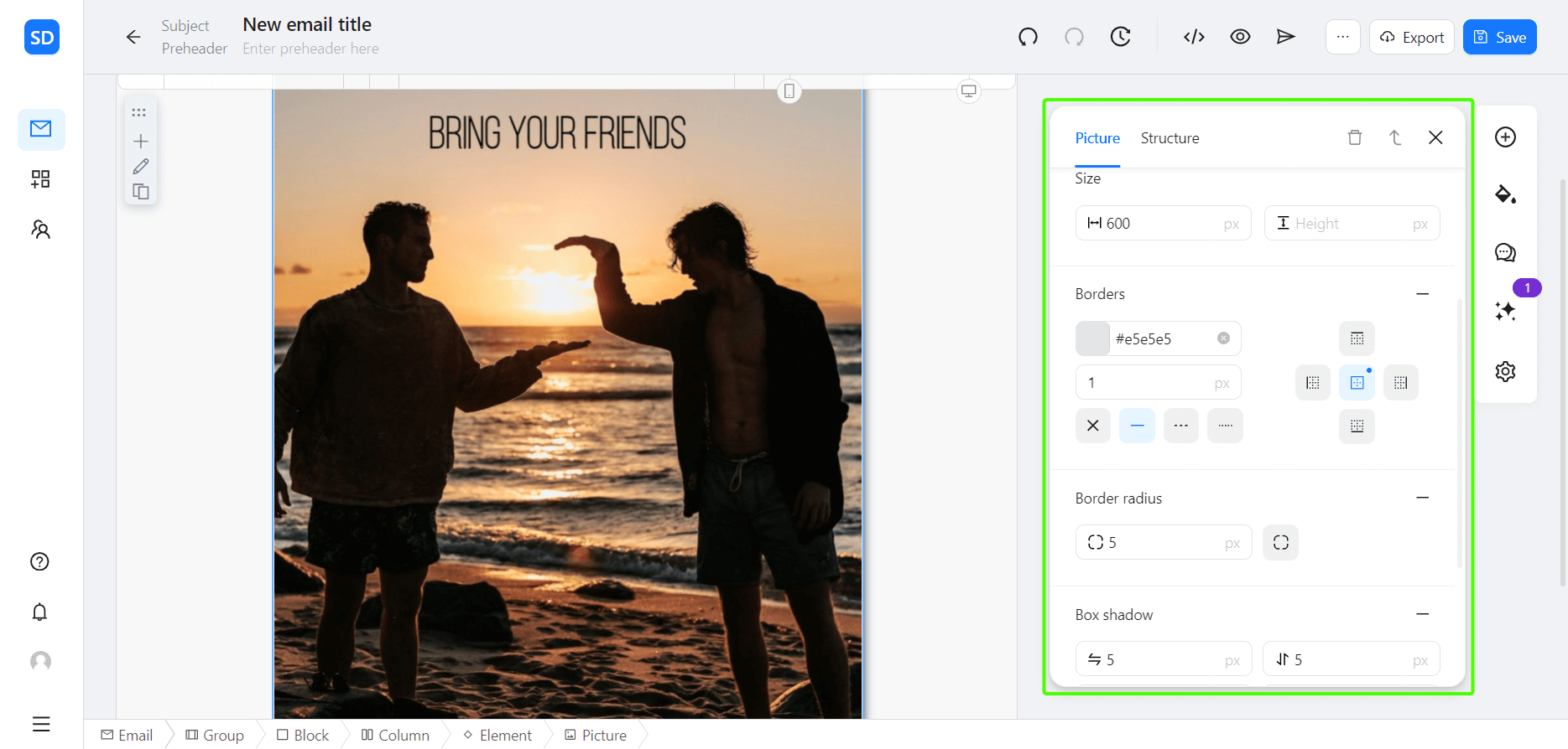
P.S. Not satisfied with the result after you add the email banner to the template? Don’t hesitate to go to the Image Center and make some changes!
P.P.S. If you’re super fancy, you can even add the shadow to the whole newsletter banner and change the corners of the photo using the menu on the right.
Conclusion
Newsletter banners are a vital element of your email marketing strategy. They enhance your newsletter’s attractiveness and increase reader engagement. Don’t forget: your effective banner should be visually appealing and align with your brand and email purpose.
Thanks to Blocks, you can get truly creative with your eye-catching email banners. Our tool is a perfect place to experiment with banner sizes, incorporate required elements, and design masterful templates that leave a lasting impression on your readers.
Design your beautiful templates with Blocks!
Make your emails stand out with every element: from banners to CTAs!
Try today!Design your beautiful templates with Blocks!
Make your emails stand out with every element: from banners to CTAs!
Try today!