Christmas Email Ideas 2023: Boost Your Holiday Campaign
Want to convert more email subscribers into customers during the holiday season? Check our advice and explore the ideas for great Christmas email templates: learn how to create a compelling Christmas email subject line, what Christmas email banner to add, how to write a unique email copy, and what mistakes to avoid in holiday campaigns!
What Banner to Add to a Christmas Email Template? 3 Creative Ideas
If you want to enhance your Christmas email campaign with an elegant newsletter banner but don’t know what picture to choose, don’t worry: we’ve gathered 3 banner ideas that will make your Christmas email templates stand out and bring you more sales!
Show Your Product on Your Christmas Banner
Your subscribers’ inboxes are full of similar Christmas emails and banners. Show them something they love you for — your products! Also, showing your product on a banner might help you increase subscribers’ awareness of your offers and make them consider a purchase.
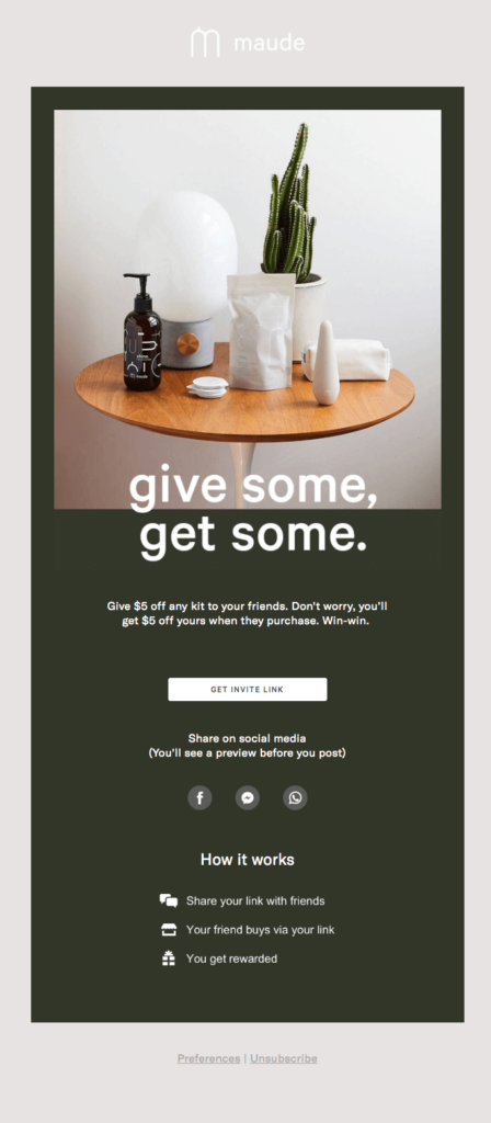
For example, Maude’s minimalist referral email template showcases the products and gives a little Christmas hint — a cactus that reminds us of a little Christmas tree.
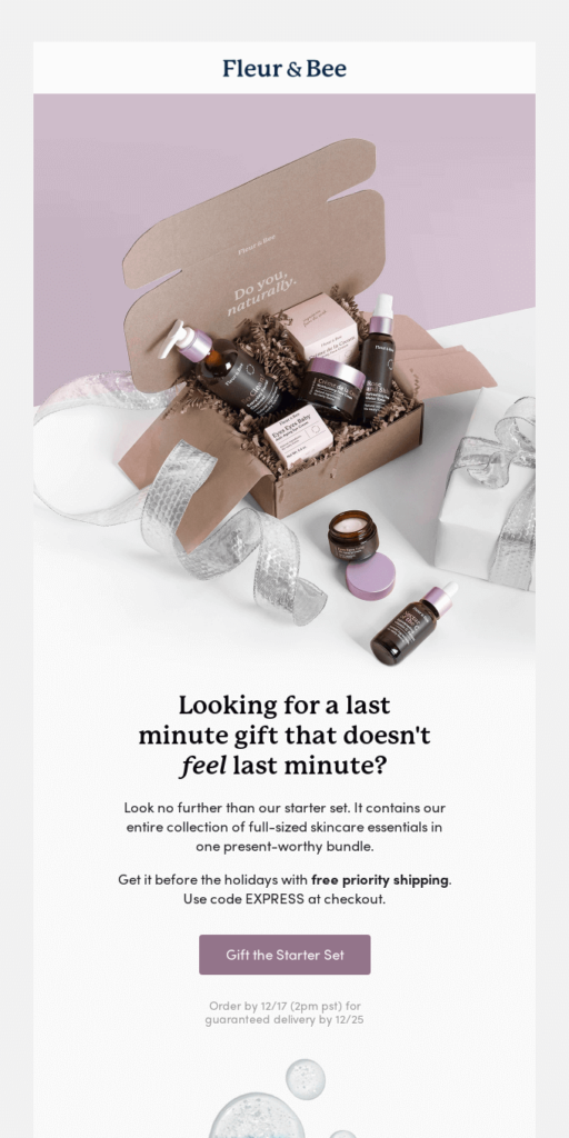
One more way to showcase your product is to add a picture of it wrapped as a gift: suggest your subscribers to give your product as a Christmas present!
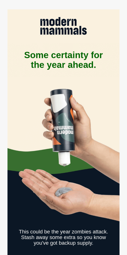
The last idea of how to include the picture with your product in a Christmas email: start with a holiday heading and continue with the picture showing how the customer can use the product as Modern Mammals did. It’s stylish, minimalist and still not void of the holiday spirit.
Create a Christmas Email Banner Similar to a Holiday Card
If you can’t imagine Christmas without a holiday card, don’t hesitate to add one to your email template! Just stay creative and don’t download the first picture you see in Google — instead, design your own banner with the Christmas spirit!
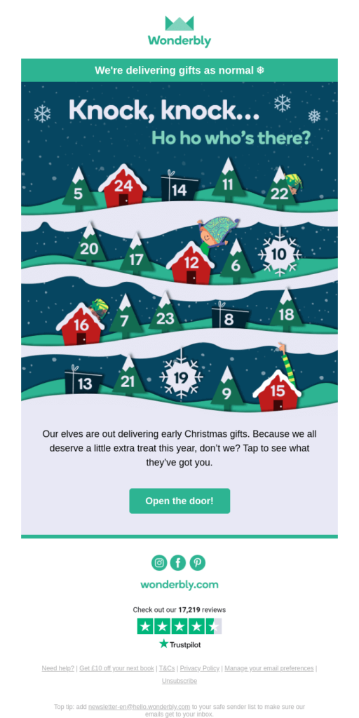
For instance, Worderbly added a Christmas banner with an Advent Calendar. It looks quite fresh and is designed with Worderbly’s brand colors.
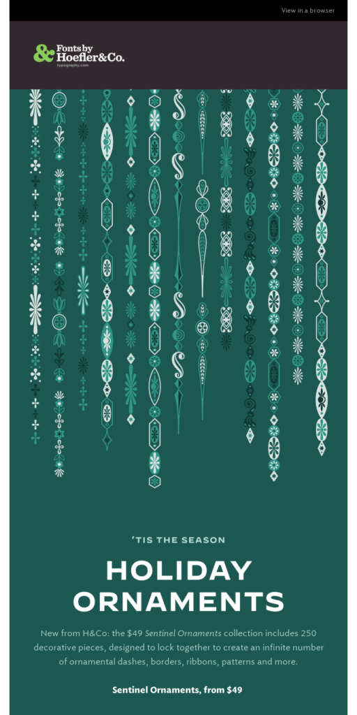
If you like traditional holiday decorations, you’ll love the next idea: Hoefler&Co advertises their holiday ornaments with a Christmas banner showing beautiful Christmas patterns. The banner looks neat, festive, and not clichéd.
Add Traditional Christmas Colors to Your Email Banner
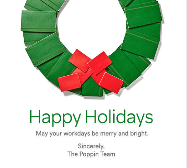
Green, red, white, and blue — these are the colors that create the Christmas spirit! Yes, these are customary colors, and that’s why your subscribers probably expect to see them in your Christmas campaigns!
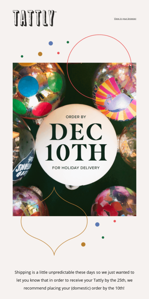
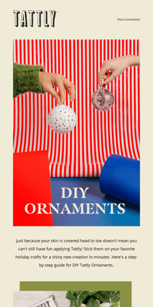
If you don’t want to make your email look too common, just add a personal touch like Tattly did: their Christmas email banner is made in traditional colors but still looks unique because of the elements like hands, a sleeve of a sweater, and Christmas bubbles. You can get inspired by this idea and add the elements that represent your brand to your Christmas email templates.
Create your best Christmas emails using Blocks!
Craft your Christmas emails with ease.
Try it for free!
Create your best Christmas emails using Blocks!
Craft your Christmas emails with ease.
Try it for free!Best Ideas For Christmas Email Subject Lines That Get Your Campaigns Opened
Let’s keep it real: subscribers got tired of subject lines like “last chance” and “biggest sale ever”: such emails no longer catch anyone’s attention and end up not being opened. To stand out in the inbox, you have to make your Christmas subject lines one-of-a-kind. Let us share with you several ideas for improving your subject lines during the holiday season.
Add Relevant Special Characters to Make Your Emails Stand Out
Don’t be afraid of adding emojis or other special characters to your subject line: although, according to the study, they do not guarantee that your email gets opened, they still make your subject line more attractive. For example, Lookfantastic often decorates their subject lines with emojis.
The 2 rules of adding emojis to Christmas subject lines are the following: keep them relevant and always test how they look on different devices. You can check it by sending test emails or using special services like Unicode.
Keep Subscribers in Suspense
Make them wonder what’s inside! Suspense is something that makes most subscribers open emails (at least, to know what’s in there). It’s a bait that captures the reader’s attention, so if you use this device, your email probably won’t go unnoticed!
To create suspense, you can give a hint about the offer (without actually offering something), tell users about some changes or plans — in a word, suggest that there’s something valuable or amusing inside your email! Here’re a few ideas from brands:
- We made you something
(Mercury Mosaics)
- Have you heard about our holiday plans? (Surety Hotel)
- The Google gift guide has something for everyone on your list (Google)
- There’s the perfect gift for everyone. (Apple)
- Our coziest gift is back! (AllTrails)
Add Practical Value to a Christmas Subject Line
During the holiday season, some of us like to keep it quick and productive when checking the inbox, so it might be a good solution to move to the value right away! Don’t write simply “Christmas sale” or “Discounts”; instead, specify the price or help your subscribers with choosing the right Christmas presents (believe us, they’ll appreciate it). Look at the subject lines from Fitbit and Momofuku:
- Boost motivation with gifts starting at $59.95
(Fitbit)
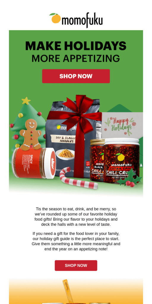
- Find the Perfect Gift for Your Favorite Food Lover (Momofuku)
Ask a Question in Your Subject Line
Subscribers love when brands engage in a conversation with them. Just remember to be elegant and polite: ask questions that are relevant to your subscribers’ interests and don’t make them too personal. Look at the examples below to learn how to ask questions in Christmas subject lines:
- Get All Your Gifts Yet? (Moment)
- Is it possible to do Christmas Consciously? (Happy Human)
- Looking for The Perfect Chess Gift This Holiday? (Chess.com)
Don’t Be Afraid of Playfulness in Christmas Emails
When the winter holidays come, people get ready for miracles and might even behave a little childish. Don’t be afraid of making your Christmas email subject lines funny: at this time of the year, your subscribers are more ready for it than ever! Look at the ideas below to get inspired.
- These ice creams aren’t going to eat themselves… (Jeni’s)
- Give iPad. And put some fun under the tree. (Apple)
- Get one thing you can count on in 2023. (Modern Mammals)
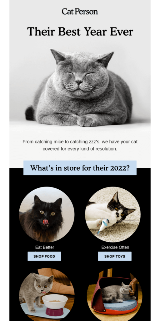
- Is it too late to say Happy New Year? (Cat Person)
Best Ideas For a Unique Christmas Email Copy
If you’re having a hard time writing a copy for your Christmas email campaign, we’ve got you covered! Just look at our ideas and get inspired.
Bring the Holiday and Green Initiative Together
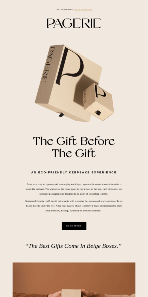
Christmas is all about being kind and mindful to others, including nature! Remind your subscribers about sustainability and offer some green ways to celebrate. For example, Pagerie’s Christmas campaign tells about a green way to wrap a present.
Include a Poem in Your Christmas Email
This point is tricky: although everyone loves an old good poem on Christmas, not every poem looks good in an email campaign. For your Christmas email templates, we’d recommend to refrain from using the regular holiday poems to avoid looking old-fashioned.
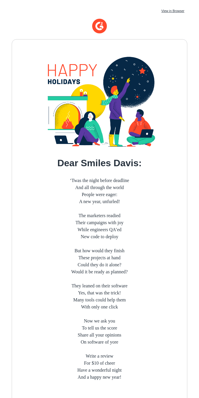
Instead, you can create your own poem with references to your industry and products! For example, the email copy below tells about the digital marketing world and asks to write a review in the form of a poem.
Keep It Minimalist and Simple
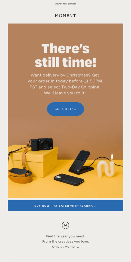
It’s always a good idea to keep it minimalist and just share a useful offer: remind your subscribers about the holidays, offer a discount, or free shipping. For example, Moment’s Christmas copy helps the subscribers to get the order in time and receive the presents by Christmas.
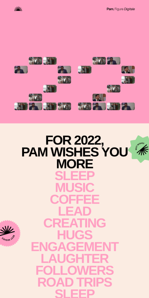
Give Christmas Wishes in Your Email Copy
If you think that there are no elegant and fresh ways to give wishes in email campaigns, let us show you at least one idea we liked the most. The secret lies in the right presentation of text: if you keep it stylish, the wishes will look completely different.
Boost your email production
Create beautiful Christmas email templates in a few clicks with Blocks
Try it for free!
Boost your email production
Create beautiful Christmas email templates in a few clicks with Blocks
Try it for free!More Ideas of Christmas Email Templates for Customers
Need more ideas for your Christmas email templates? We’ve found 7 great examples that might inspire you!
Include a Christmas GIF in Your Email
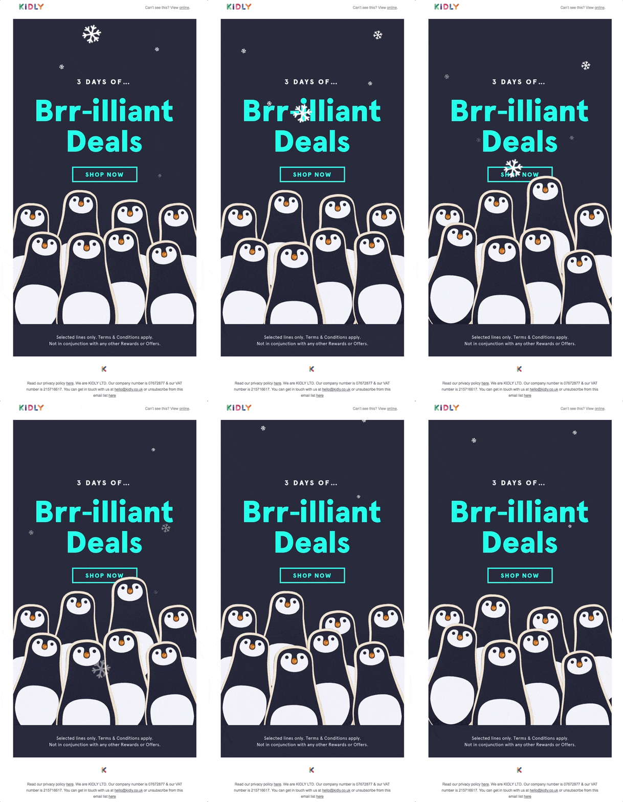
GIFs always make email campaigns stand out and put a smile on a subscriber’s face. Make sure that your GIF matches the style of the email campaign and displays correctly. If you’re wondering whether everything’s alright with your email GIF, try editing your email template in Blocks: it allows you to preview all the elements and check whether they display correctly, and what’s more, it’s code-free!
Look at this email by Kidly: the GIF is the main element of the design and it’s responsible for creating the Christmas spirit in this campaign.
Experiment With Collages in Your Christmas Campaign
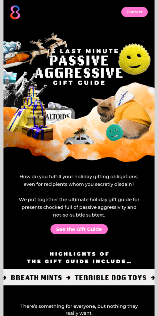
If you don’t know what pictures to add to your Christmas email template, add a collage! It looks fresh and draws people’s attention to the content.
Add a Comic Strip to the Template
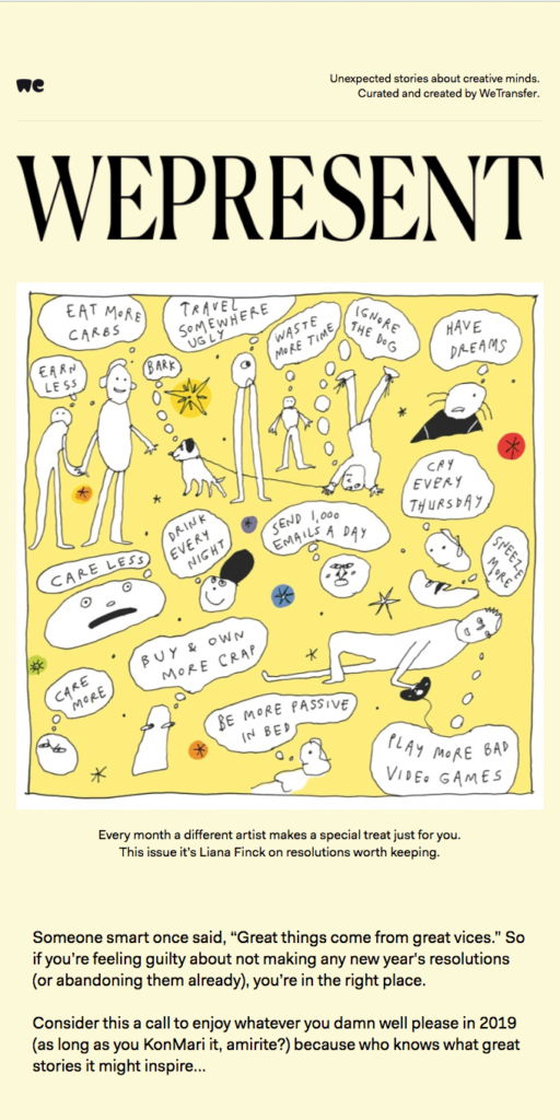
Pop art style is one more unhackneyed way to present your content in Christmas email templates. It makes your email look catchier and fresher than the same email with the usual pictures.
Include Customer Reviews in Your Christmas Campaign
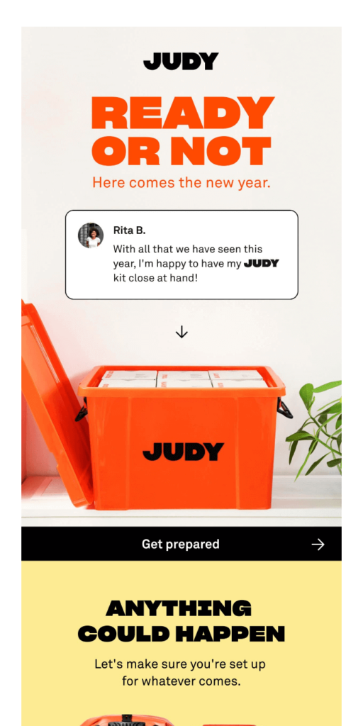
A high-quality customer review is a No. 1 tool for increasing sales, so why not use it in a Christmas email? Look at the way Judy included a customer review to the New Year campaign: it’s not only about the review, but also about the way it’s presented.
Use the Familiar User Interface in a Template
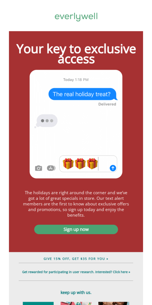
What if a subscriber discovers a familiar user interface in an email campaign? Everlywell tried it in their holiday email: they used a banner with the iMessage interface and this detail became the killer feature of the whole email!
Draw the Subscribers’ Attention to the Main Purpose of Your Email
It’s okay to just point out the main purpose of your Christmas campaign and make your subscribers see it right away. For example, the next email brings the discount to the front in a stylish way.
Give Subscribers the Options to Choose From
Want to give several offers in one Christmas email campaign? There is a way to do it delicately: just make the offers match your brand style, keep them interesting, and don’t include too many offers in one email.
3 Practical Tips for Crafting a Christmas Email Signature
Add even more festivity to your Christmas template by creating a holiday email signature. Our tips will help you craft the perfect Christmas signature and make your email even more personal and memorable.
Include Christmas Imagery
Embrace the holidays by including Christmas images in your email signature. These could range from Christmas trees to candles or presents, or anything else associated with the occasion! You can make your Christmas email signature highly stylized and original, or stick to something more regular and traditional.
Keep It Consistent with the Brand Design
Craft the holiday email signature to fall in line with your brand design. Additionally, pay special attention to the overall layout of your email to keep it clear and coherent.
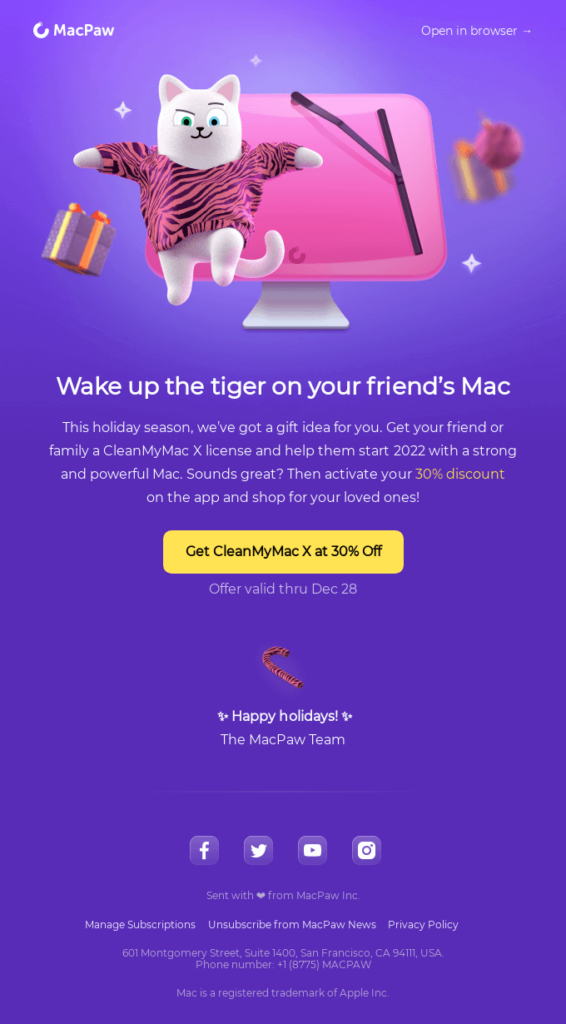
Mac Paw showcases a great example, with a simple yet stylized signature that underlines the overall newsletter design. Such consistency ensures that the signature blends seamlessly with other elements of the email.
Go for Minimalism by Using Text Only
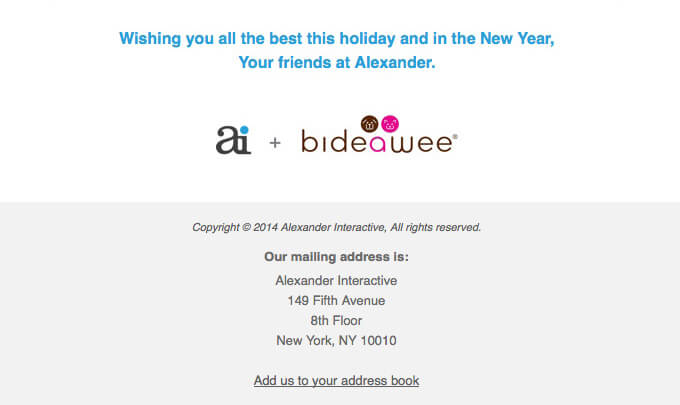
If you feel that images aren’t a good fit for your Christmas email signature, ditch them and use simple text instead. Congratulate your subscribers with the upcoming holidays in a more creative way or keep it more down-to-earth, like Alexander Interactive did in its signature. And, of course, don’t forget to include the name of your company and/or logo since these are the essentials of a holiday email signature.

Mistakes in Christmas Email Campaigns
You might miss out on additional holiday sales because of the mistakes in your Christmas email templates. Look at the good and bad examples of Christmas email campaigns below and check your email designs for the following mistakes.
1. Be Careful With the Fonts
Don’t try to make your emails look fancy by using enough fonts to choke a reindeer. When you try to accentuate every line, the main idea of the text gets lost.
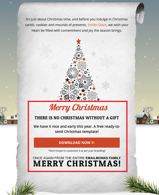
How many fonts can you count in the email below?
Solution: Use 2-3 fonts per email. Keep in mind that not all email providers support custom fonts. The best solution: choose standard fonts and try to come up with creative solutions for other email elements. And if you want to underline a message, create a neat CTA that will actually stand out.
2. Don’t Centralize the Copy
Using central alignment for a large text is usually a bad idea: it makes the email look like a poem (or even a ballad) and feels rather odd. The main rule here is avoid using central alignment, underlined, italic, and bold text to highlight big fragments of text.
Solution: Use left alignment and make sure to break the text into digestible pieces. If you want to create something unusual, go for broken grid design.
3. Don’t Make Your Christmas Email Copy Too Long
If you write walls of text, your subscribers simply won’t read it. It’s a lose-lose situation: the subscribers won’t get your message, missing out on your offer while you will lose your potential profit.
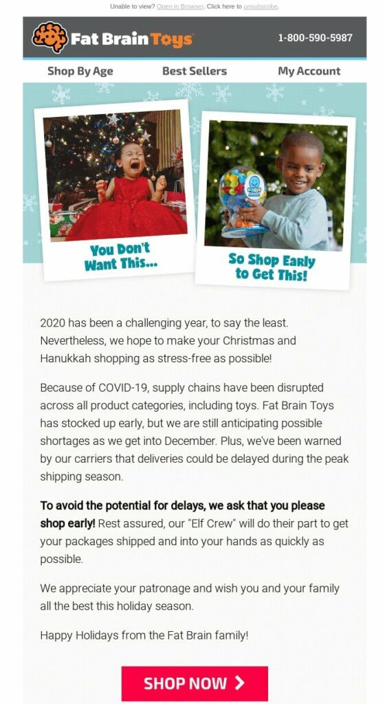
Solution: Keep the text to a minimum and break it into blocks. Here’s a perfect example of how you can remind your subscribers to make a purchase early in a laconic way.
4. Don’t Make Your Footer Too Long
Don’t make your footer twice as long as your email. We understand that some information belongs in the footer only, but it’s not a place for showing off and telling your whole story. Its aim is to give the most necessary information: ways to contact you, a link to a website, social media links, etc. So, please, leave out the number of your awards or the name of your dog unless it’s vital.
Solution: Keep your footer simple. A nice footer should contain:
- the unsubscribe link (!)
- your address
- social media links
- legal information like privacy policy, terms and conditions, and copyright.
5. Don’t Use Too Many CTAs and Colors
If you use too many CTAs and colors in one email, a subscriber will be more likely to close the email than try to figure something out.
Solution: Use one or two clear CTAs that will resonate with the audience. We should highlight the most important information in the email and give subscribers a little nudge in the right direction.
Want to Сreate More Christmas Email Templates in Less Time?
Try our code-free drag-n-drop editor: it will save your resources and optimize the time spent on email design and coding. Make more Christmas email templates in less time with Blocks! Try it for free.
If you want to learn more about other email marketing conferences and expos read our articles about the April Fool’s Day, International Women’s Day, or Easter.


 (Fitbit)