How to Make a Confirmation Email: Examples & Best Practices
You can’t imagine online business and ecommerce without confirmation emails. Once you’ve signed up on the website or made a purchase online, you expect some kind of proof that everything went as intended. That’s what confirmation emails are for.
But that’s just the tip of the iceberg. Confirmation emails might play a crucial role in your marketing if you treat them right. And this is exactly what we’re going to cover in this article.
Dive into 9 best practices, discover 13 excellent confirmation email examples, and learn:
- what are the types of confirmation emails;
- why are confirmation emails important;
- how to write a confirmation email;
- how to send a confirmation email;
- how to create your confirmation email template with Blocks.
Design efficient confirmation emails with Blocks!
Create your confirmation email templates fast & easy.
Try it for free!
Design efficient confirmation emails with Blocks!
Create your confirmation email templates fast & easy.
Try it for free!5 Main Confirmation Email Types
Confirmation emails vary according to their purpose and industry. Based on that, we can single out 5 distinct types:
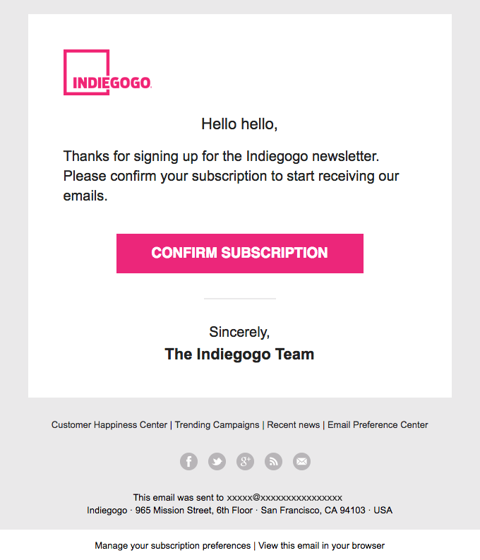
1. Subscription confirmation email. After you’ve subscribed to a newsletter, this would be the first email to hit your inbox. It serves as a welcome message and confirms your intention to receive further emails from the company.
For example, here’s how Indiegogo greets the new customer in its subscription confirmation email:
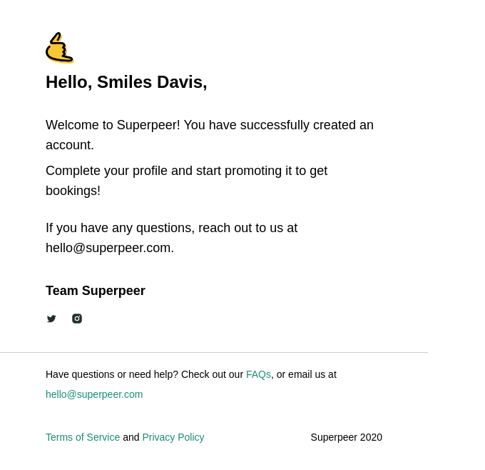
2. Registration confirmation email. This message is sent whenever you sign up on a website or in an app. It contains the account details and, if necessary, might specify additional steps to finish the process.
Here’s the registration confirmation email example by Superpeer. It welcomes the subscriber and invites them to complete their profile:
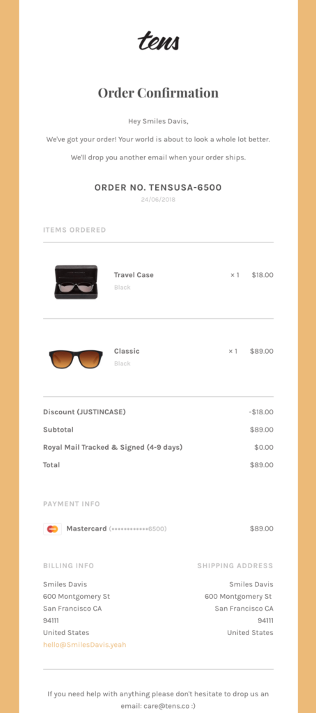
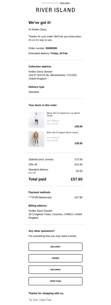
3. Order confirmation email. You receive this one after placing an order or making a purchase online. Order confirmation email contains all the related details: from the product price and quantity to customer information and shipping address. Basically, it serves as a guarantee that your order has been processed properly.
Tens shows a great (and a very detailed) order confirmation email example here:
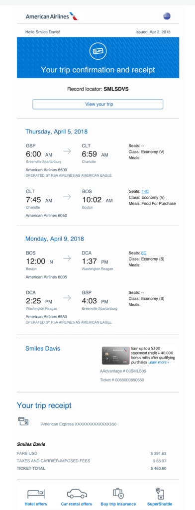
4. Booking confirmation email. Expect this one whenever you reserve a seat (for instance, on a plane) or a hotel room. It contains the information about your booking: from flight date and route to hotel address and room number.
Here’s the booking confirmation email from American Airlines that provides an excellent visual example:
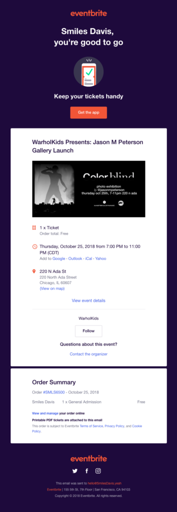
5. Event confirmation email. This one lands in your inbox after you sign up for an event (like a live show or webinar). Event confirmation email usually contains the date & time, venue location (or a link, in case of an online event), and other related data.
Here’s an example from Eventbrite that showcases how an event confirmation email may look like:
Are Confirmation Emails Really That Important?
From a consumer standpoint, confirmation emails are clearly significant: they act as visual proof of their actions and allow them to double-check the details. But you might be surprised how important they are to marketers as well.
It’s easy to brush confirmation emails aside as just transactional messages, yet they might become a prominent tool for your long-term email strategy. And here are 3 solid reasons for that:
- With an average value of 60%, confirmation emails enjoy one of the highest open rates among all email types. The explanation is simple: confirmation emails are sent as a response to certain actions. This makes them anticipated and reduces their chances of being ignored.
- Confirmation emails might be the very first direct piece of communication with your brand. In this case, they become responsible for the first impression and influence the customer’s decision to learn more about your products or services.
- In addition to their primary purpose, you may actually use confirmation emails for marketing! Showcase a new line of products, include a special discount for the next order, or provide some other extra value and make the customers come back to you.
How to Send a Confirmation Email
The preparation of confirmation emails requires several steps. These may vary slightly depending on the platform you use, but in general, we can highlight 3 stages on how to send confirmation emails:
- Create an opt-in list. Use the email software of your choice to create an opt-in list and separate new subscribers and customers from the existing ones. This provides a better understanding of your user base and allows you to trigger the confirmation emails accordingly.
- Set up the triggers. Different events require different responses, and that’s exactly where triggers come in handy. Set up separate triggers for all the specific actions (like, for example, sign up or checkout).
- Craft the emails & automate the process. Now comes the time to create the confirmation email templates! The best practices listed below will help you at this stage. After you’ve crafted the emails, align each of them with the required trigger and run some tests.

Confirmation Email Best Practices
Did you know that 64% of consumers named confirmation emails as the most valuable messages in their inboxes? If you want to live up to their expectations, stick to these 9 best practices. They’ll help you write a flawless confirmation email and make it effective to the max.
Keep your confirmation emails straightforward
First and foremost, the primary goal of a confirmation email is to convey important and useful information. Provide exactly that and make the purpose of your email crystal clear right from the beginning.
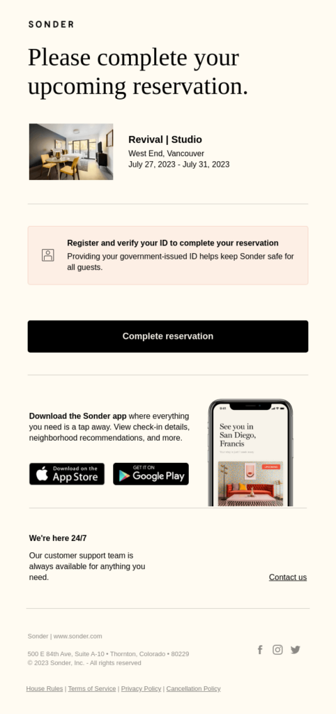
Take a look at the confirmation email example by Sonder: the first thing you see after opening the message is the reason why the email was sent.
Summarize the necessary details
This practice goes in line with the previous one. Your confirmation email must contain all the necessary data related to its type and subject.
In particular, summarized details handle 2 important functions:
- they serve as an additional guarantee from the company;
- they provide the opportunity for the customer to personally check everything whenever needed.
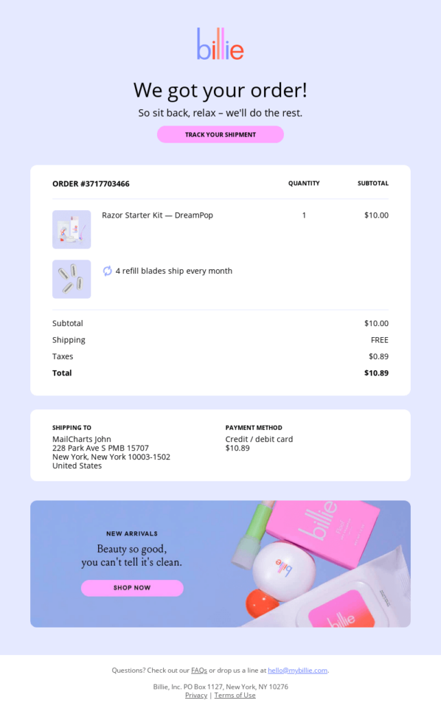
The confirmation email example by Billie shows this best, with all the required details located in the email body.
Address the customer by name
Statistics show that personalized emails are opened 82% more often than generic ones. Thankfully, most modern ESPs allow you to add the subscriber’s name in a couple of clicks: instead of something like “Your order has been confirmed”, go for a more personal “Hey John Johnson, your order is on the way!”.
Take a look at this confirmation email example by MunchPak: the subscriber’s name is the first thing that grabs your attention.
Express gratitude
Isn’t it nice that the customers chose you over a competitor? Provide sincere appreciation in your confirmation emails to show how much you value the customers’ support and trust. Even a small gesture can go a long way for your brand image.
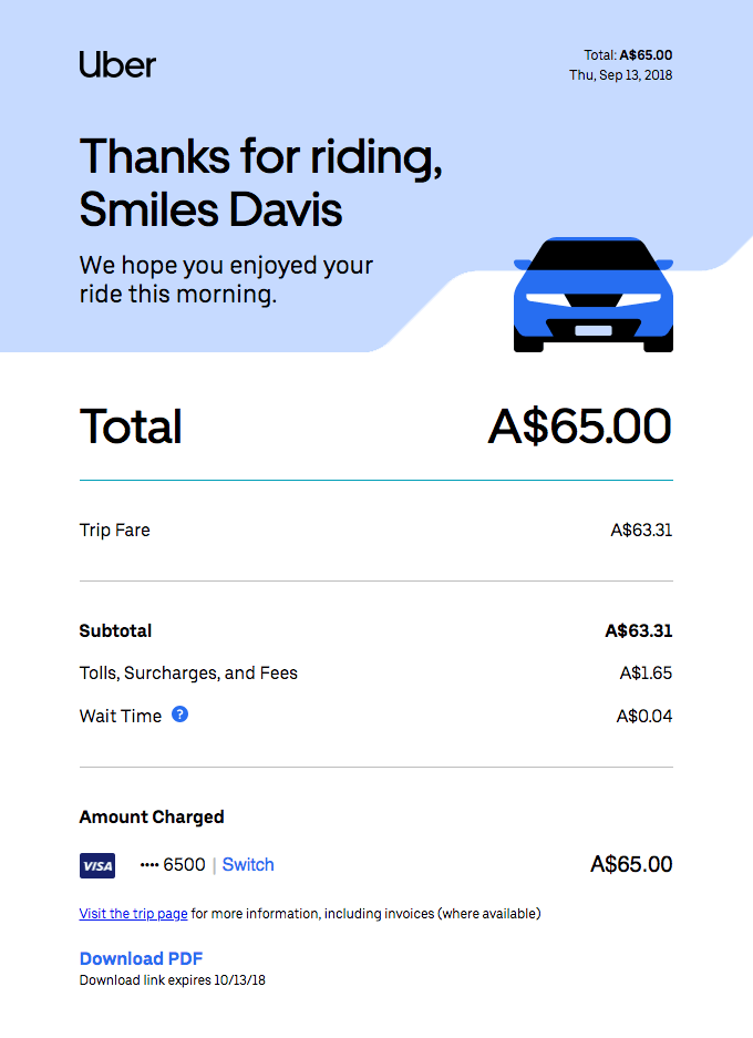
Check how Uber shows gratitude in its excellent confirmation email example: 2 simple yet polite sentences make the message feel sincerely warm.
Incorporate brand elements
Show off your branding and style in confirmation emails! Make even a simple transactional message recognizable and memorable through the use of:
- corporate logos;
- mascots;
- brand’s color scheme;
- humorous subject line and email copy consistent with the brand identity.
Why does it matter? First off, this makes it clear that the message is sent from your brand, and no one else. And second, branding will liven up your confirmation email templates and make them much more eye-catching.
Take a look at this confirmation email example by Just Eat. Order checkout probably has never been this cute.
Specify your contact information
What if something goes wrong, like an error occurs after the checkout? Or maybe a customer has some specific questions and wants to reach out to you?
For this case, provide your contact information directly in the confirmation email. Indicate that you’re ready to resolve the issues and give your subscribers additional peace of mind.
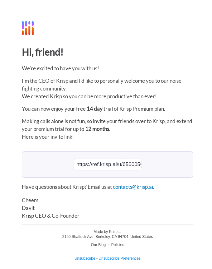
The confirmation email example by Krisp does exactly that and includes an email address for any questions that may arise.
Make use of CTAs
Direct and clear calls-to-action (CTAs) will guide your subscribers to the next step. For instance, CTAs may lead them to confirm their subscription (in case of a double opt-in) or track their order.
You may also use CTAs in your confirmation email templates to drive further engagement, for example:
- invite the customer to continue browsing the website;
- propose them to join your social media;
- encourage them to use a special offer, etc.
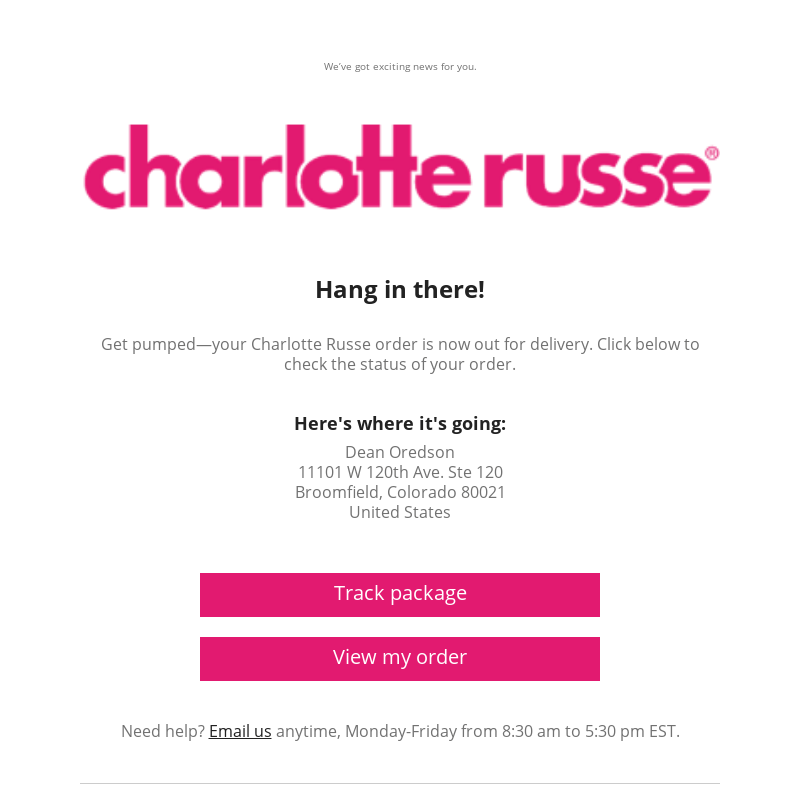
And of course, it’s possible to use several CTAs if one is not enough. Though keep their number reasonable and include no more than 2 principal CTAs (exactly how Charlotte Russe did in its confirmation email example).
Ensure responsiveness
Nowadays, 85% of users check their emails on smartphones. This obviously means that your confirmation email templates must be mobile-friendly. Whether visually rich or modest, always keep them responsive and provide quality checks for different devices and screen sizes.
The confirmation email example by ASOS here shows what a mobile-friendly email may look like.
Check & proofread carefully
Since your confirmation email is a very important piece of communication, it must be mistake-free. Check the contents of your email template and eliminate anything that might leave a bitter aftertaste: from grammar and spelling errors to broken links or images. Ensure that the template looks and functions properly before you put it to actual work.
But even if a mistake still slips into your confirmation email, don’t panic. Promptly admit it, send a heartfelt apology to your subscribers, and fix the problem as soon as possible.
Craft your confirmation emails with Blocks
Build excellent confirmation email templates in a few clicks!
Sign up for free!
Craft your confirmation emails with Blocks
Build excellent confirmation email templates in a few clicks!
Sign up for free!Design Your Confirmation Email Templates with Blocks
Now that you’ve learned how to write confirmation emails, it’s time to craft yours! Blocks is ready to assist you and make the process as smooth as possible. Create a free account and get ready to build your outstanding confirmation email templates in a matter of minutes!
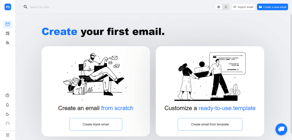
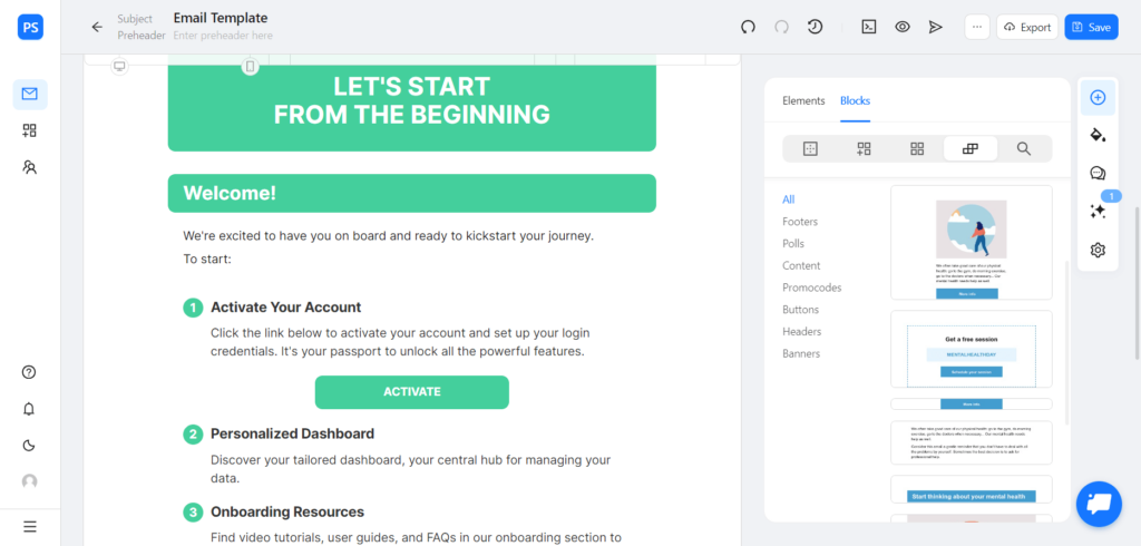
There are a couple of options to choose from. For example, if you wish to craft your confirmation email template from scratch, create a blank email and fill it with the required content. It’s fast, easy, and intuitive!
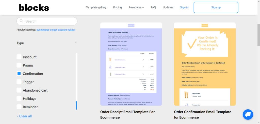
Looking for a ready-made confirmation email template instead? No problem! Simply head to the template gallery and choose the one you like the most. Load the selected confirmation email template into the editor and customize it how you see fit!
Conclusion
Even the simplest confirmation email templates require effort and attention to detail. Embrace their advantages and use them to build trust and loyalty. These key takeaways will be a perfect starting point:
- address the customer by name & show your gratefulness;
- keep the confirmation email straightforward;
- include all the required details;
- show off your branding to make the email outstanding and memorable;
- provide additional engagement through CTAs;
- indicate your contact information;
- make your confirmation email templates mobile-friendly;
- proofread & test your confirmation emails before putting them to work.
Whenever you need to craft a confirmation email template, Blocks is at your service. Sign up for free and create your email from the ground up or browse through the gallery, select the suitable confirmation email template, and make it truly yours with the help of customization.
