How to Design an Email of Your Dreams: An Ultimate Guide
The first step is always the most difficult. Yes, even if we’re talking about email design.
When you decide to craft an email from scratch, you might face tons of questions. What are the optimal email template size, width and height? What should an email newsletter size be? What about the fonts and the colors?
To stay on track in your email design journey, you’ll need proper directions, and that’s exactly why we decided to write this guide. Why us? We built 100+ perfect email templates and even more unique emails for our clients. Join us as we go through the whole process of creating a perfect email both with the help of HTML and Blocks, our no-code email editor.
Part 1. Let’s Start From the Beginning
First things first, we need to understand what your email template dimensions should be. Proper email height and width are crucial for correctly displaying the content and delivering the message to your audience. And since email template dimensions (including its content) are usually measured in pixels (px), we’re going to stick to that in our guide as well.
How Wide Should My Email Be?
For a long time, the average width of an email was 600px for desktop, and 320px for vertical & 480px for horizontal orientation on mobile devices. As time went on, however, screen resolutions became higher. Today, according to this article by Selzy, the perfect width for a desktop version of your email is 640px; mobile width stays the same.
Sure, your email can be wider than 640px, but try not to exceed the threshold of 800px. The thing is, different email clients have their own settings and limitations, and you have to fit into those borders if you want all of your recipients to get the best version of your message. And in case your email doesn’t fit into the threshold, test it for every email client to make sure it doesn’t get corrupted and/or broken.
Keep in mind one more thing: if you make the mobile version of your email 480px wide, users will have to flip their phones to see the email correctly. As in case with the desktop width, you can make it wider than 320px, but be sure to test it through.
How Long Should My Email Be?
When it comes to email height, the only limit is your imagination (and the file size). The perfect email length stands at 1500px, but you may make it longer, even up to 3000px! Keep in mind, though, that the longer your email is, the higher the chance that users will just say “too long didn’t read” and simply close it.
And if you’ve got a lot of content to share in your email, consider structuring it: use bullet points, shorten the paragraphs, add headings. On top of that, you may place some information onto images, use GIFs, or even attach a video!
What Should My Email Newsletter Size Be?
Your email should not exceed the weight of 102 KB (and shouldn’t be less than 20 KB). Always keep that in mind and try not to overload your email with lots of content (and we’re not just talking about images or videos here).
Email file size is measured through the HTML code weight. The more lines of code there are, the bigger the file will be. This is why you need to keep an eye on the content volume, as every block counts (so to speak).
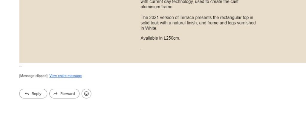
But what if you go beyond the limit of 102 KB? Well, the outcome is simple: some email clients (like Gmail, for example) will clip your email. If a footer is cropped, sometimes it might be ok to go with it, but if your email gets clipped in the middle, it’s a whole different story. Keep an eye on that.
How to Build an Email From Scratch in Blocks?
Blocks allows you to build a beautiful email without writing a single line of code! Let’s take a closer look at how to create a basic structure for your email template with the help of our no-code builder:
Part 2. How to Make Your Email Shine
The basic structure of our email is ready, and now it’s time to take a closer look at its elements. Let’s talk about email layout & how to design it properly.
1. Preheader & Header (Height, Width, Contents)
Preheader is a thin line above the email. Usually, it’s also displayed after the subject line. Preheaders can expand on the subject line (for example, tell about free shipping or extra discounts), or serve a strictly practical purpose (like containing the “view in browser” link).
When it comes to preheader text formatting, there are a couple of things to keep in mind. Preheader font size should be smaller (but not too small, of course) than that of the email body. For example, if the email body font size is 14px, keep it around 10-12px for a preheader. As for the preheader height, 55-60px is enough: if you make it bigger, it will stand out way too much.
And, of course, don’t forget about the text length of your preheader: it must remain between 50 and 100 symbols.
Now let’s look at the email header. It usually contains your company’s logo alongside the buttons, menu, or other elements. Here are some tips regarding its size.
If a header contains a standard-sized logo, the best height option is 70px. If you add a button/copy into the header (or use a bigger logo), it’s okay to increase the height to 100-150px. For a header with a menu, consider increasing the height up to 200px. Yet always remember: a long header will draw too much attention.
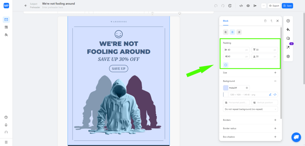
Besides the upper and the lower paddings, you can also add paddings to the left and to the right of your blocks. Unlike their top and bottom counterparts, these should be equal for the whole email, i.e. if you use 40px side paddings in your email body, these should be 40px in preheader and header as well.
As for the header design, your imagination and the overall style of the email are the limit. The only thing to keep in mind is that all the elements must remain consistent both on desktop and mobile.
2. Banner (Height, Width, Dos and Don’ts)
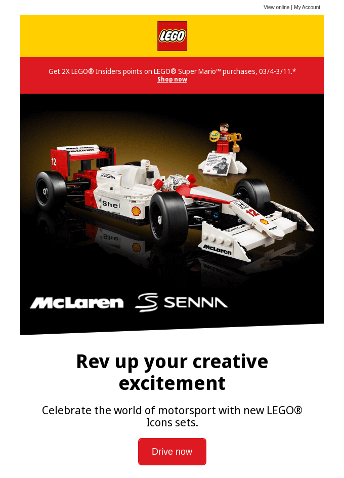
Email banner is a JPG, PNG, or SVG image that draws the most attention and serves as the perfect canvas to show off some creativity. You can play with your email banner size, font styles (including their size as well), and different colors. Though, of course, always stay reasonable: an email banner overcrowded with content will probably turn into a mess rather than a tool to catch the eye.
Email image dimensions:
Email banner width usually depends on the overall width of the email. For example, if your email is 600px wide on desktop and 320px wide on mobile, you may keep the banner at the same width. You can also add side paddings to it, though remember that side paddings must remain consistent throughout the email (if it’s 40px in all other blocks, it should be the same for the banner).
As for the email banner length, there is no real limit besides keeping it reasonable. Though we advise you to make the banner 700px-1400px long. A longer banner will probably do more harm than good to your email.
Do you want to create email banners in a blink of an eye?
Use Blocks AI image generation feature!
Try it for free!
Do you want to create email banners in a blink of an eye?
Use Blocks AI image generation feature!
Try it for free!3. Copy (Font Style, Size, Colors, Formatting)
When it comes to email copy design, it’s easy to get confused. What’s the best font size for email? Maybe there’s some professional email font and size you must use? Among dozens of options, which to choose for my email?
Don’t worry, it’s not difficult at all. We’ll help you choose the perfect font style, height, line spacing, color, and formatting for your email.
Font style:
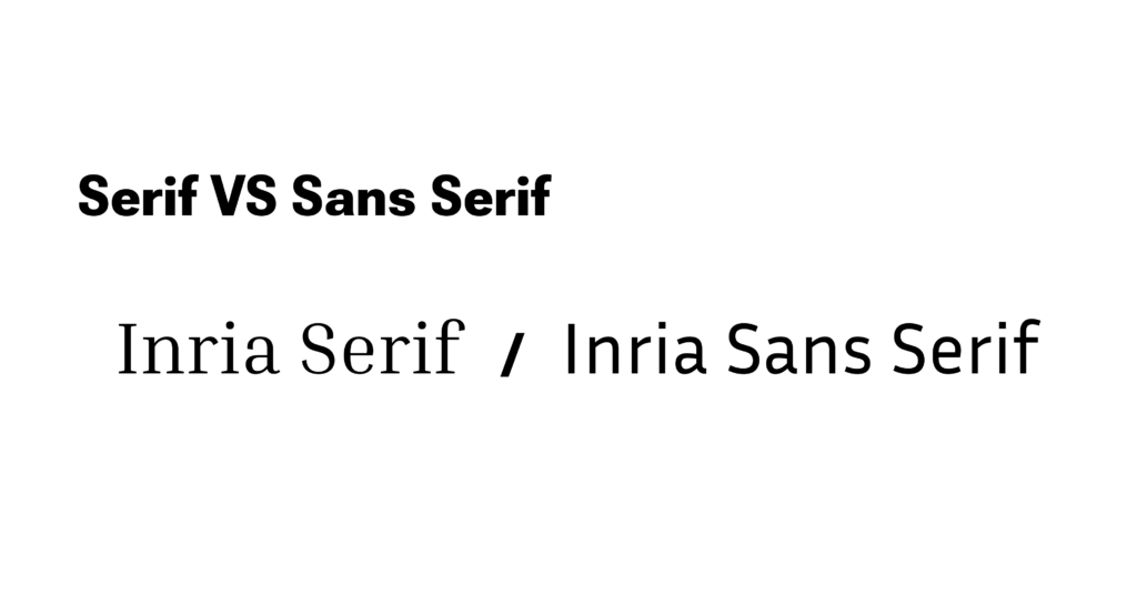
There are two main font style groups: Serif and Sans Serif. The difference is squiggles on the letters: Serif family fonts have them while Sans Serif family fonts don’t.
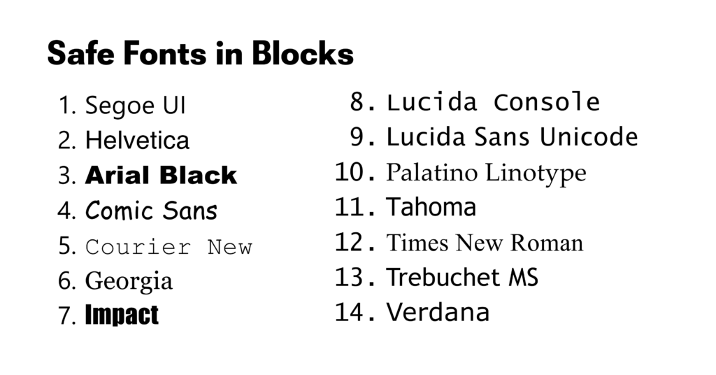
At first, Blocks only had a set of limited font styles. Yet after a series of updates, we support Google fonts too! The starter font kit contains the safe fonts: font styles that will properly display on all types of devices and email clients. Here they are:
Google fonts, on the other hand, are a bit tricky: some email clients and devices may display them incorrectly. You can still use them, of course, however when you do, be sure to test your emails before sending them out.
We advise you to use no more than one font style for your email. This will allow you to maintain consistency and readability, and also help with making the copy more distinct (which is quite an important accessibility feature of any email).
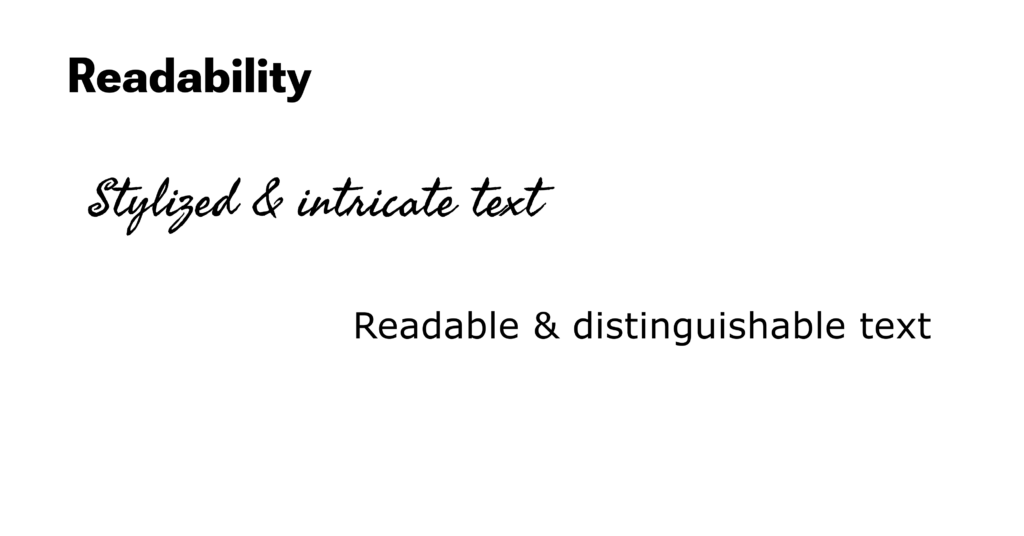
And speaking of readability, take a look how it differs based on the font style alone:
Sure, the second option looks much fancier, but it’s way harder to read.
Font & line size:
After trying several combinations of headings, subheadings, and text height, we came to the conclusion on the preferable font size:
- 22-24px for headings;
- 18-20px for subheadings;
- 14-16px for the regular text.
As for the perfect line height, keep it at 150-200%. This way, your text will be distinguishable and pleasing to the reader’s eye.
And remember: there’s no such thing as professional email font and size. It all depends on the context and your artistic decision. Though, of course, always ensure email readability and avoid making the text too big or too small.
Font color:
Our advice here is similar to that about the font styles: use no more than two font colors for the whole email. Go for contrasting ones to enhance the accessibility of your text.
Text formatting:
There are 3 main options to format the text and highlight its specific parts: you can make it bold, italics, or underlined. Let’s take a closer look at how to use each of them:
- The bold formatting is commonly used to highlight the words that a reader should pay attention to (for instance, a date, sales condition, etc.).
- Italics is used to highlight quotations and titles of books, movies, etc.
- And finally, we underline links: it’s a common way to use this type of formatting.
Though not mandatory by any means, these practices have become a custom: people are more likely to pay attention to bold text and click on the underlined text. Keep that in mind for your email copy as well.
4. Buttons (Width & Height, Color, Fonts, Paddings)
Just as in case with email banner size, no exact limits exist for buttons. Still, there are some general rules & recommendations that will let you use this element most effectively.
- Buttons must stand out against the background and other content of your email. They must remain eye-catching and immediately noticeable for the readers.
- Buttons must be big enough in the mobile version of your email so that the readers won’t have problems with tapping on it.
- Use contrasting colors when designing buttons to make them distinguishable.
- Utilize white space and add paddings to the CTA on the button. This way, it will be easier to read and click.
5. Content Blocks (Number of Elements in the Grid, Their Dimensions and Style)
There are many types of content blocks: articles, product grids, quotes, etc. At their core, all of them are tables, composed of one or several columns. Word of advice: it’s better to use no more than 4 columns for product grids and 2 columns for other types of content blocks.
Also keep in mind that a too lengthy block may discourage the recipient to read further (and we obviously don’t want that). Stay within the reasonable bounds and keep the height of one content block at 200-300px. The height of all content blocks in your email should be around 1000-1200px.
Looking for email templates with colorful & engaging content blocks?
Blocks template gallery comes to the rescue
Check the templates
Looking for email templates with colorful & engaging content blocks?
Blocks template gallery comes to the rescue
Check the templates6. Footer (Width, Height, Obligatory & Optional Content)
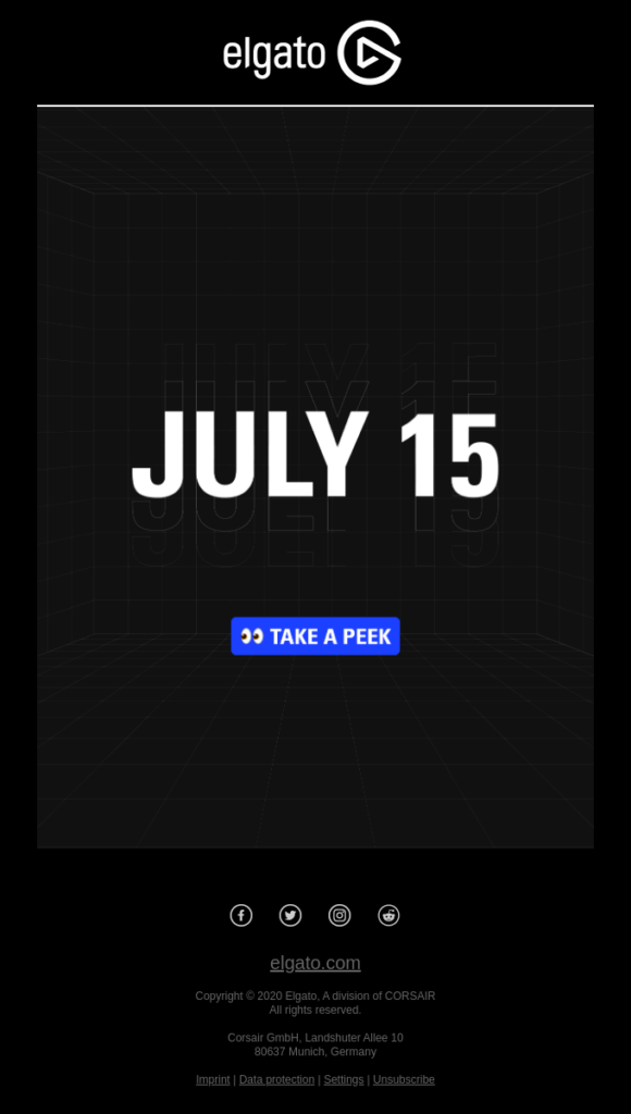
Footers bear a more practical function in emails. The size of the footer depends on the amount of content within it. A typical footer contains:
- Company’s physical address.
- Social media links.
- Company contacts (phone number and/or email address).
- Mobile app link / QR code.
- Reminder why a recipient got the email.
- Privacy policy link.
- “Unsubscribe” link.
It should be noted that both the CAN-SPAM Act and GDPR require you to include the opt out link for the recipients in the US and EU, accordingly. Even if you don’t work directly with these countries, you might still have American or European clients in your user database.
Therefore, it’s always better to include the “Unsubscribe” link in the footer, just to be on a safe side. Make it visible and allow your subscribers to opt out in one click. And the last thing: no ESP will allow you to send an email without the “Unsubscribe” link. Even if you forget to add it, they will remind you or add it automatically (like Selzy).
In addition to the already listed elements, you may also include other items in your footer (like menus, information on current sales, and more).
Finally, it’s time to talk about the footer dimensions. The footer width should be exactly the same as the email width, while its height depends on the content amount. Still, keep the height of your footer at least 200px.
Part 3. Finishing Touches and Testing
Our email is ready! All that’s left are some final steps.
Check whether the paddings between the elements are of the same height. They shouldn’t be too small or excessively large: the perfect size is 30-40px. Also, make sure that the text height is consistent throughout the blocks, every image contains alt text, and all the links are in place.
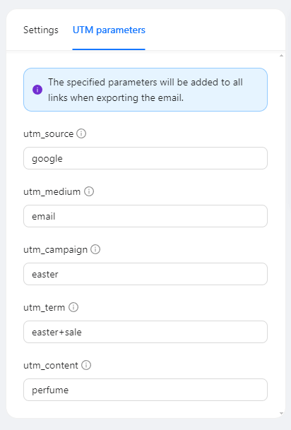
Don’t forget to add UTM tags to the links (if needed). UTM tags are short lines of code that allow you to track the performance of your campaigns. If you code your email manually, you will need to add them to each link one by one, but in Blocks you can easily add them for every link in a couple of clicks!
Next, check how your email looks and works on mobile devices (as lots of people use them to read emails). And finally, send a test email to check whether it’s displayed correctly on every device and email client.
Conclusion
As you can see, it’s not difficult to design a beautiful email from scratch! Sure, some recommendations (for example, email template dimensions) are a bit more strict than the others (like choosing the best font size for email). Yet with the help of our in-depth guide, we’re sure that your email design journey will always remain right on track!
Want to build proper emails without having a need to keep too much info in your head?
Blocks can help you do it!
Try it now!
Want to build proper emails without having a need to keep too much info in your head?
Blocks can help you do it!
Try it now!